Technical analysis is in the works?
LEARN with us, one element at a time

Say what? Dow Jones again?
The general framework for technical analysis was first laid out in the late 1800s by Charles Dow, one of the co-founders of the Dow Jones & Company and The Wall Street Journal.
This approach was referred to as the “Dow theory.” As part of his research into market movement, Charles Dow also invented the Dow Jones Industrial Average (see Indices).
Technical analysis enables traders to study the markets and to predict future price movements using past price data and patterns. Instead of looking at “value” through earnings or news (fundamental), technical analysis focuses on charts, price trends, and technical indicators.
This method is useful for all asset classes (stocks, forex, cryptocurrencies, and commodities). Beginners can start by learning basic charts, then move to indicators, patterns, and more advanced strategies.
Premises of technical analysis
The market discounts everything
Fundamentals, psychology, everything is already reflected in the current price
Prices tend to move in trends
Prices are more likely to continue in a direction, than to reverse
History repeats itself
Human behavior is considered consistent, when responding to market impulses
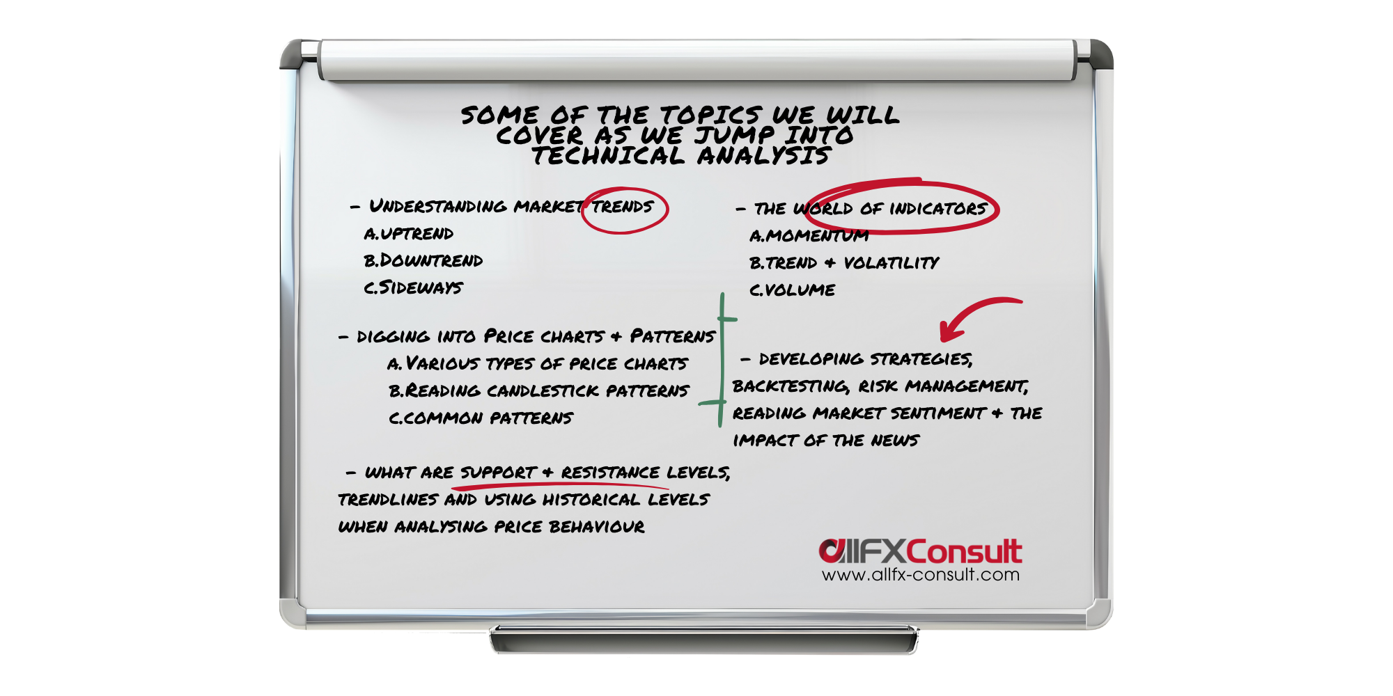
Components of technical analysis
Levels where pressure caused prices to reverse in the past. Buying overcoming selling pressure is support while selling overcoming buying pressure is resistance
Price charts
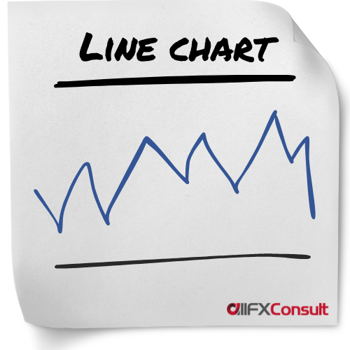
Line charts are also called close-only charts and for good reason. They take the closing prices of a given period, connect the consecutive points and create a line to represent their move.
Technical analysis today needs to be as accurate as possible, and a line chart doesn’t give the details of a trading session.
Many analysts favour line charts for their simplicity, since they regard the closing price of a session as the most important information to know. Dow (from Dow Jones) was one of these analysts.
Although more detailed charts are favoured by most, they can get really cluttered and don’t allow traders to spot events like a tight divergence.
Line charts display a clear trend direction, chart patterns and they can spot support/resistance levels, sometimes more accurately than other chart types.
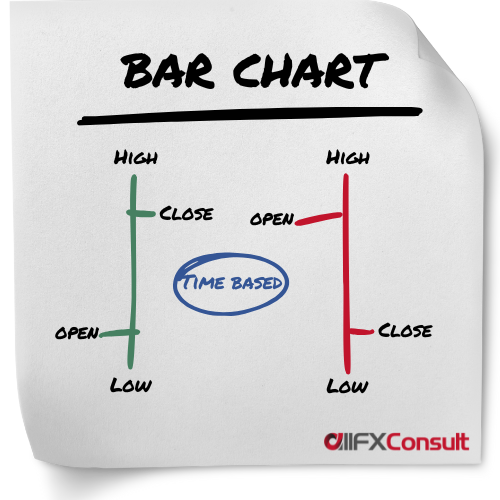
Bar charts were the most widely used charts before candlesticks were invented in the 18th century. They provide a more detailed representation of prices, since they display the closing price like a line chart, together with the opening price, and the highest/lowest price points reached in a session.
Knowing the added details, a trader can have a visual representation of the volatility of the security during a session. The opening price is always on the left, while the closing price is on the right.
Colours green and red, provide a quicker display of bearish or bullish sessions, making them more accurate than simple line charts. The colour of the bar, is chosen after calculating the difference between current closing price and previous closing price of the session rather than the open and close.
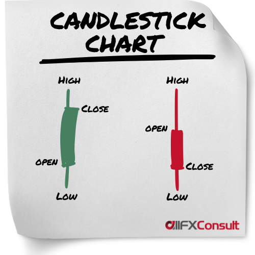
Candlestick charts, are the most commonly used charts in technical analysis. Their origin was traced back to the 18th century in Japan, tracking the price of rice, and they became very popular ever since.
They display the same information as bar charts, but in a different format. Wicks on top and below the bar display the highest/lowest prices of the session.
Colours green (or white) and red (or black) are also showing bearish and bullish sessions, but they take into consideration the opening and closing price of a session, rather than the closing of the previous session. The colours show the “real body” of the candlestick.
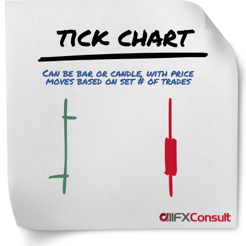
A new bar or candlestick is formed after a specific number of trades (ticks) have occurred, instead of after a time period.
A single bar might form in seconds during high activity or take minutes to form during a slow period.
This approach compresses low-activity periods and expanding high-activity periods, for a dynamic market representation.
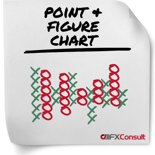
Provide a clear, simplified view of price movements by filtering out noise. These charts use columns of X (for rising prices) and O (for falling prices) to visualize price moves.
Can be subjective, as traders must set a “box size,” the price increment that must be reached to plot a new X or O. A “reversal amount,” typically three boxes must also be set (the price must move in the opposite direction before a new column of Xs or Os is started).
Best suited for position trading aiming to capture broader market moves rather than short-term trading.
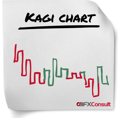
A preset reversal amount is determined (fixed amount, percentage, or based on Average True Range, and only when reached, a new line is plotted on the chart, ignoring time and volume in the process.
A number of vertical lines are connected in a series with short horizontal lines (also called shoulders when a rising vertical line connects to a vertical falling line). The horizontal lines are called waists when a vertical falling line connects to a vertical rising line.
To signal bullish or bearish trends, the lines change thickness or colour. A thick (or green) line is formed when the price increases above a previous high, known as Yang line. A thin (or red) line is formed when the price falls below a previous low, known as Yin line.
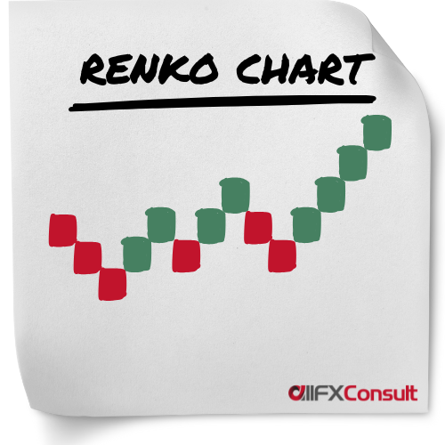
The charts are bult using uniformed sized bricks, as the name “Renko” from the Japanese word renga, means “bricks”.
A “brick size” is specified by the trader (by dollar value, number of pips, or average true range), which is the amount the price must move, before a new brick is added.
The new bricks, are placed at a 45-degree angle (up or down), adjacent and to the right of the previous brick.
When the price moves twice the “brick size”, the chart reverses and starts adding bricks in the opposite direction.
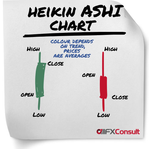
This chart resembles the candlestick chart type, with the difference that it averages all data points to smooth out price action and reduce the noise.
It’s a preferred choice by many professional traders, because it makes it easier to identify trends in comparison to traditional chart systems. Heikin Ashi means average bar, and it is used by traders to see the trend and general direction of the market, to signal reversals in trends, and support any trend strategy that makes sense.
New to trading?
Visit our beginner section
Technical Indicators
Overlay
Displayed directly on the price chart
Oscillators
Displayed in a separate panel below the price chart
Trend
Identifies the presence, direction, and strength of market trends
Simple Moving Average (SMA)
The Simple Moving Average, or SMA, is a trend-following indicator used to smooth out price movement and show the general direction of an asset. Traders use it to understand whether prices are overall rising, falling, or staying flat.
SMA works by adding up the prices of the last “N” periods and dividing by N. For example, a 20-day SMA adds the last 20 closing prices and divides by 20. This creates one average point. As each day passes, the oldest price is removed and the newest is added, creating a smoother trend line.
Formula: SMA = (Sum of past N prices) ÷ N.
SMA works best in combination with RSI, MACD, and Bollinger Bands because these indicators confirm momentum, overbought/oversold levels, or volatility.
Its main limitation is that it reacts slowly. During sudden price spikes or drops, SMA may lag and cause late signals.
To avoid false signals, check the larger trend. For example,
- Price moving slightly above the SMA in a strong downtrend is often false.
- Also look for volume confirmation. If price crosses the SMA but volume is low, the signal is weak. Check if other indicators agree.
- A crossover with no RSI or MACD support is usually unreliable.
- Watch for whipsaws. These are quick moves above and below the SMA (usually happens in rangebound).
Best parameters are 20-day, 50-day, and 200-day SMAs. For stricter and more accurate signals, use longer averages like 50 or 100 periods because they filter out the noise.
For day trading, 5-min, 15-min, and 1-hour SMA charts are the most reliable.
You can use SMA to enter a position when price moves above the SMA with confirmation from RSI or MACD. You can use it to exit when price drops below the SMA after being above it for a while.
Hypothetical Example (for reference only):
- Price is below the 50-SMA on a 15-min chart.
- Price rises and closes above the SMA.
- RSI moves above 50, confirming strength.
- Enter a buy position.
- Place a stop-loss below the recent low.
- Exit when price closes back below the SMA.
Exponential Moving Average (EMA)
Exponential Moving Average or EMA, is a trend indicator that reacts faster to price changes than the SMA. Traders use EMA to spot trend direction and momentum changes more quickly. Because it gives more weight to recent prices, it helps detect early signals.
EMA works by applying a multiplier to recent prices so the newest prices matter more. This makes EMA more sensitive and useful for fast-moving markets. While the SMA treats all days equally, the EMA “pays attention” to what’s happening now.
Formula: EMA = (Closing Price × Multiplier) + (previous day’s EMA) × (1 – Multiplier)
- where Multiplier = 2 ÷ (N + 1).
EMA is best combined with MACD (which uses EMAs), RSI for confirmation, and volume indicators.
Its main limitation is that it can give too many signals during noisy or sideways markets because it moves quickly.
To spot false signals:
- Check the strength of the trend.
- If EMA crosses but price is barely moving, it is often false.
- Confirm with RSI. If EMA gives a buy signal while RSI stays below 50, momentum may be weak.
- Check higher timeframes. If the 1-hour trend is down but the 5-min EMA crosses up, the signal may fail.
- Confirm volume. If volume is low during the crossover, it may be unreliable.
Best parameters include the 9-EMA, 12-EMA, and 26-EMA. For stricter accuracy, use longer EMAs like 20, 30, or 50 periods.
For day trading, 1-min is too noisy, so 5-min, 15-min, and 1-hour are more accurate.
You can enter a position when price crosses above the EMA and RSI confirms momentum. Exit when price crosses below the EMA.
Hypothetical Example (for reference only):
- On a 5-min chart, price is below the 20-EMA.
- Price breaks above the EMA strongly.
- RSI moves above 50.
- Enter a buy.
- Place stop-loss below the EMA.
- Exit when price closes under the EMA.
Ichimoku Cloud
Ichimoku Cloud is a trend and momentum indicator used to visualize support, resistance, trend direction, and potential reversal zones all in one chart. Traders use it to quickly assess market conditions.
Ichimoku Cloud works using five lines: Tenkan-sen (short-term average), Kijun-sen (medium-term average), Senkou Span A and B (forming the cloud), and Chikou Span (lagging line). Price above the cloud indicates an uptrend; below indicates a downtrend. The cloud’s thickness shows strength or weakness of the trend.
Formulas:
Tenkan-sen = (Highest High + Lowest Low) ÷ 2 over 9 periods
Kijun-sen = (Highest High + Lowest Low) ÷ 2 over 26 periods
Senkou Span A = (Tenkan-sen + Kijun-sen) ÷ 2 plotted 26 periods ahead
Senkou Span B = (Highest High + Lowest Low) ÷ 2 over 52 periods plotted 26 periods ahead
Chikou Span = Close plotted 26 periods back
Ichimoku works well with RSI, MACD, and volume to confirm trend strength.
Limitations include complexity for beginners and lag in choppy markets. False signals often occur when price is inside the cloud or when trend reverses quickly.
To find false signals:
- check trend direction: only trade in the direction indicated by cloud color.
- Confirm breakouts with volume. Use Chikou Span for additional confirmation. If it lags above price in a downtrend, the signal may be weak.
- Compare multiple timeframes to reduce false signals.
Best parameters are standard 9-26-52 periods. For stricter signals, use longer periods like 12-26-52 to reduce noise.
For day trading, 5-min, 15-min, and 1-hour charts are most accurate.
Ichimoku can help enter positions when price breaks above the cloud in an uptrend with confirmation from Chikou Span and volume. It can help exit positions when price falls below the cloud or the trend weakens.
Hypothetical Example (for reference only):
- On a 15-min chart, price breaks above the cloud.
- Confirm Chikou Span is above price and volume rises.
- Enter buy position.
- Place stop-loss below the cloud.
- Hold as long as price stays above cloud.
- Exit if price closes below cloud or Chikou Span signals weakness.
Average Directional Index (ADX)
The Average Directional Index (ADX) is a trend strength indicator used to measure how strong a trend is, without indicating its direction. Traders use it to decide whether to trade trends or avoid choppy markets.
ADX works by comparing the difference between the positive directional movement (+DM) and negative directional movement (-DM) over a set period, then smoothing the result. Higher ADX values indicate a stronger trend, while low ADX shows weak or sideways markets.
Formulas:
+DI = 100 × (Smoothed +DM ÷ ATR)
-DI = 100 × (Smoothed -DM ÷ ATR)
DX = 100 × |+DI – -DI| ÷ (+DI + -DI)
ADX = Smoothed DX over N periods
ADX works well with trend indicators like SMA, EMA, MACD, and directional crossovers to confirm trend entries.
Limitations include lag in detecting trend changes and no indication of trend direction. False signals occur in low volatility or sideways markets.
To find false signals:
- check trend direction. Rising ADX in a sideways market may give fake strength signals.
- Confirm with price direction: ADX above 25 is strong only if +DI or -DI aligns with trend.
- Use multiple timeframes. A 5-min ADX spike may be unreliable if the 1-hour chart shows sideways price.
Best parameters are 14 periods. For stricter signals, use 20 periods to smooth noise. For day trading, 5-min, 15-min, and 1-hour charts are most effective.
ADX can help enter positions by signaling strong trends when above 25 with +DI or -DI confirming direction. It can help exit positions when ADX starts declining, indicating trend weakening.
Hypothetical example (for reference only):
- On a 15-min chart, ADX rises above 25 while +DI > -DI.
- Confirm price is in an uptrend.
- Enter a buy position.
- Place stop-loss below recent support.
- Hold while ADX remains above 25.
- Exit when ADX declines or -DI crosses above +DI.
Volatility
Measures the degree of variation in the price over a specified time
Bollinger Bands
Bollinger Bands are a tool that helps traders see when a price is stretched too high or too low compared to its recent average. Think of them like a flexible rubber band around price. When price pushes too far outward, it often snaps back toward the middle.
What It Is Used For:
Bollinger Bands help spot overbought and oversold conditions, volatility changes, and possible reversals or breakouts.
How It Works: There are three lines:
- The middle band is a Simple Moving Average (usually 20-period).
- The upper band is the average plus two standard deviations.
- The lower band is the average minus two standard deviations.
When the price touches or breaks the bands, it shows strong pressure.
Formula:
Upper band = SMA(20) + 2 × Standard deviation
Lower band = SMA(20) − 2 × Standard deviation
Best Indicators to Combine With:
RSI, MACD, and volume help confirm if a band touch is real or false.
Limitations:
Price can “ride the band” for a long time during strong trends, causing traders to enter too early.
How to find false signals:
- Trend check: A touch of the upper band in a strong uptrend is not a sell signal. If price keeps making higher highs, the signal is likely false.
- Candle confirmation: If price touches a band but the candles show no reversal pattern (like a bounce or a strong color change), the signal may be weak.
- Volume: Low volume on a band touch often means the move is not strong enough to reverse.
- Middle band reaction: Price must move back toward the middle band after the touch. If it doesn’t, the signal is likely false.
- RSI agreement: If RSI does not show overbought/oversold at the same time, the signal is less trustworthy.
Best Parameters:
20-period SMA with 2 standard deviations is standard and reliable.
Stricter Parameters:
Use 20-period with 2.5–3 standard deviations for fewer, more accurate signals.
Day-Trading Timeframes:
5-min, 15-min, and 1-hour charts tend to be most stable.
Using Bollinger Bands to Enter:
Buy when price touches the lower band and then shows a clear bounce upward, ideally confirmed by RSI or volume.
Using Bollinger Bands to Exit:
Sell when price reaches the upper band and starts turning downward, especially if RSI also shows weakness.
Hypothetical Example (for reference only):
- Watch a 15-min chart. Price falls and touches the lower Bollinger Band.
- Check RSI: it is near or below 30, confirming oversold pressure.
- Wait for a green candle to close above the previous candle. This shows a real bounce.
- Enter a buy trade as the bounce begins.
- Place a stop-loss slightly below the recent low.
- Hold the trade as price moves toward the middle band.
- Take profit at the middle band or upper band, depending on strength.
Average True Range (ATR)
The Average True Range (ATR) is a volatility indicator used to measure how much an asset typically moves during a period. Traders use it to understand risk, set stop-loss levels, and detect potential breakouts. ATR does not indicate trend direction but shows how strong or calm price movement is.
ATR works by calculating the true range, which considers the current high minus the current low, the absolute difference between the current high and the previous close, and the absolute difference between the current low and the previous close. Then, the average of these true ranges over a set number of periods is taken.
Formula:
True Range = max[(High – Low), |High – Previous Close|, |Low – Previous Close|]
ATR = Average of True Range over N periods
ATR works well with trend-following indicators like SMA or EMA, and with breakout systems.
Its limitation is that ATR only shows volatility, not trend direction, so a high ATR could occur in both upward and downward moves.
To avoid false signals,
- confirm volatility changes with price direction. For example, a sudden ATR spike during consolidation may not indicate a real breakout.
- Compare ATR readings across timeframes. If ATR rises on a 5-min chart but the 1-hour chart shows low volatility, the signal may be weak.
- Combine with volume (low volume on a rising ATR can indicate a false move).
Best parameters are 14 periods, which balance responsiveness and smoothing. For stricter signals, use 20–21 periods to reduce false volatility spikes. For day trading, 5-min, 15-min, and 1-hour charts are most effective.
ATR can help enter positions by indicating when volatility is increasing before a breakout. It can help exit positions by adjusting stop-loss levels according to current volatility.
Hypothetical example (for reference only):
- On a 15-min chart, ATR rises sharply while price breaks above recent highs.
- Confirm rising volume to ensure the move is strong.
- Enter a buy position at breakout.
- Place a stop-loss at one ATR below entry.
- Adjust stop-loss as ATR changes to protect profits.
- Exit when price closes below the adjusted ATR stop.
CBOE Volatility Index (VIX)
The CBOE Volatility Index (VIX) is a volatility indicator, often called the “fear index.” It measures the market’s expectation of volatility over the next 30 days based on S&P 500 options prices. Traders use it to anticipate market uncertainty and potential large price moves.
It works by analyzing option premiums: high premiums signal higher expected volatility. Mathematically, it involves a weighted formula of call and put option prices, which calculates the expected variance of the S&P 500 index.
VIX is often combined with trend indicators like moving averages or momentum tools to decide if a spike in fear could signal a reversal.
Limitations: VIX does not predict direction, only magnitude of potential moves.
False signals occur when VIX spikes during normal pullbacks without broader market confirmation.
Spotting false signals
- confirm market direction with price action or trend indicators.
For day trading, shorter-term VIX changes can help anticipate intraday volatility, though it is mostly used on daily to weekly charts. Alternative parameters include using VIX derivatives like VIX futures for more precise entry timing.
VIX can help enter positions: high spikes may indicate oversold conditions and potential rebounds; low levels suggest complacency and possible breakdowns. It can help exit positions: rising VIX warns of increased risk, suggesting tightening stops or partial exits.
Hypothetical example (for reference only):
Asset: S&P 500 ETF (SPY). VIX rises from 15 to 25 while SPY dips sharply. Enter long on SPY near support, confirmed by bullish candlestick patterns. Place stop-loss below the support level. Exit partially as SPY rebounds and VIX begins to decline, signaling reduced fear and lower volatility.
Keltner Channel
The Keltner Channel is a volatility and trend indicator used to identify overbought and oversold conditions, breakout opportunities, and trend direction. Traders use it to time entries and exits.
It works by plotting a center line (typically an EMA) with upper and lower bands based on Average True Range (ATR). Price touching the upper band can indicate overbought, the lower band oversold.
Formulas:
Middle Line = EMA (usually 20)
Upper Band = EMA + (Multiplier × ATR)
Lower Band = EMA − (Multiplier × ATR)
Keltner Channels work well with RSI, MACD, or trend indicators to confirm breakouts or reversals.
Limitations include false signals in sideways markets, where price may repeatedly touch bands without trending.
To find false signals:
- confirm price direction and volume. Breakouts above the upper band with low volume may fail.
- Check trend alignment with EMA. If EMA is flat, signals are weaker.
- Use multiple timeframes. A 5-min breakout may fail if 1-hour chart shows consolidation.
Best parameters to use are 20 EMA, 2 ATR multiplier. Stricter signals: 50 EMA, 2.5 ATR to reduce noise. Day trading: 5-min, 15-min, and 1-hour charts.
Keltner Channels can help enter positions when price closes above the upper band in an uptrend or below the lower band in a downtrend with confirmation. They help exit positions when price reverts toward the middle line or opposite band.
Hypothetical example (for reference only):
- On a 15-min chart, price closes above upper Keltner band with rising volume.
- Confirm EMA trending up.
- Enter buy position.
- Place stop-loss near middle line.
- Hold as long as price stays above upper band.
- Exit if price closes below middle line.
Momentum
Determines the strength of a trend, by how fast price changes
MACD
MACD (Moving Average Convergence Divergence) is a momentum indicator used to measure the strength and direction of a trend. It helps traders see when momentum is increasing or decreasing and when a reversal might happen.
MACD works by subtracting the 26-EMA from the 12-EMA to form the MACD line. A 9-EMA of that line becomes the Signal Line. When the MACD line crosses above the Signal Line, it suggests upward momentum. When it crosses below, momentum is weakening. The histogram shows the difference between the two lines.
Formulas:
MACD Line = EMA(12) – EMA(26)
Signal Line = EMA(9) of the MACD Line
Histogram = MACD Line – Signal Line
MACD works best with RSI and EMA because these confirm momentum and trend direction.
Its limitations include lagging signals and poor performance in sideways markets where crossovers happen too often.
To find false signals
- check the trend direction. A bullish MACD crossover during a downtrend is often false.
- Look for histogram strength. If the histogram barely grows after a crossover, momentum is weak.
- Use RSI confirmation. If MACD says “buy” but RSI stays below 50, the signal may fail.
- Check price action. If candles show indecision (dojis or tiny bodies), MACD signals may be unreliable.
- Also check higher timeframes. If the 1-hour MACD is bearish but the 5-min shows a bullish crossover, the small signal may reverse quickly.
Best parameters are the standard 12-26-9. For stricter accuracy, use longer EMAs such as 20-50-10 to reduce noise.
For day trading, the best timeframes are 5-min, 15-min, and 1-hour.
Use MACD to enter when the MACD line crosses above the Signal Line with strong histogram growth. Use it to exit when the MACD line crosses below the Signal Line.
Hypothetical example (for reference only):
- MACD histogram turns from red to green on a 15-min chart.
- MACD line crosses above Signal Line.
- RSI moves above 50.
- Enter a buy.
- Place stop-loss under nearest support.
- Exit when MACD crosses back down.
Relative Strength Index (RSI)
The Relative Strength Index (RSI) is a momentum indicator that helps traders understand when a stock might be rising too fast or falling too fast. Think of it like a pressure meter for price movement. When pressure becomes extreme, a reversal may be near.
What Is It Used For?
RSI is used to find overbought (above 70) and oversold (below 30) conditions. This helps traders guess when price might slow down, reverse, or pause.
How Does It Work?
RSI compares recent positive price movement (gains) with negative movement (losses). It then gives a score from 0 to 100.
- High score means lots of buying pressure
- Low score means lots of selling pressure
Math Formula (simple form):
RSI = 100 – (100 ÷ (1 + RS))
RS = Average Gain ÷ Average Loss over N periods
Best Indicators to Combine With:
- Bollinger Bands (for price extremes)
- Simple Moving Averages (SMA) (to confirm trend direction)
- MACD (to confirm momentum shifts)
Limitations:
RSI can stay above 70 or below 30 for a long time in strong trends. Acting immediately on these levels can lead to mistakes.
How to Spot False Signals (detailed):
- Check the trend direction:
RSI “overbought” is not a sell signal during a strong uptrend. If price is making higher highs and staying above long-term SMAs, the signal may be false. - Look for RSI divergence:
- Bearish divergence: price makes a higher high, RSI makes a lower high more reliable.
- No divergence, signal may be weak or false.
- Confirm with another indicator:
If RSI drops below 30 but Bollinger Bands show no bounce, the oversold signal may be unreliable. - Watch volume:
A reversal is stronger when volume increases. Weak volume often means a false signal. - Check multiple timeframes:
If a 5-min chart shows oversold but a 1-hour chart shows strong uptrend, the signal is likely false.
Best Parameters:
14 periods is the standard and most balanced setting.
Stricter Alternative Parameters:
Use range of 20-80, instead of 30-70. Will provide fewer signals, but it will filter out the noise.
Use 20–30 periods. These give fewer signals but more accuracy and fewer false alarms.
Best Day-Trading Timeframes:
RSI is most reliable on 5-min, 15-min, and 1-hour charts. Very short charts (1-min) create noise and false signals.
Using RSI for Entries:
Enter when RSI goes below 30 and rises back above 30, showing sellers are weakening.
Using RSI for Exits:
Exit when RSI goes above 70 and falls back below 70, showing buyers are weakening.
Stochastic Oscillator
The Stochastic Oscillator is a momentum indicator used to show overbought or oversold conditions by comparing closing price to the high-low range over a period. Traders use it to anticipate reversals and confirm trends.
It works by calculating %K, which shows where the current close is relative to the recent high-low range, and %D, a moving average of %K. Values above 80 indicate overbought conditions; below 20 indicate oversold.
Formulas:
%K = ((Close – Lowest Low) ÷ (Highest High – Lowest Low)) × 100
%D = 3-period SMA of %K
Stochastic works best with RSI, MACD, and trend indicators like SMA/EMA.
Limitations include giving false signals in strong trends, overbought or oversold readings may persist.
To spot false signals:
- check trend direction: in a strong uptrend, oversold %K may not indicate a reversal.
- Look for divergence: if price makes new highs but %K does not, a reversal is likely.
- Confirm with volume. Weak volume can produce false signals.
- Compare multiple timeframes: a 5-min oversold signal may fail if 15-min or 1-hour charts show strong momentum.
Best parameters are 14, 3, 3 (periods for %K, slowing, %D). Stricter signals use 20, 5, 5 for more reliable reversals. For day trading, 5-min, 15-min, and 1-hour charts are preferred.
Stochastic can help enter positions when %K rises above 20 from oversold, confirmed by %D crossover and trend. It can help exit positions when %K drops below 80 from overbought.
Hypothetical example (for reference only):
- On a 15-min chart, %K drops below 20.
- %K crosses above %D, forming a bullish signal.
- Confirm green candle and rising volume.
- Enter buy position.
- Place stop-loss below recent low.
- Exit when %K rises above 80 or candles show weakness.
Average Directional Index (ADI)
The Average Directional Index (ADX) is a trend strength indicator used to measure how strong a trend is, without indicating its direction. Traders use it to decide whether to trade trends or avoid choppy markets.
ADX works by comparing the difference between the positive directional movement (+DM) and negative directional movement (-DM) over a set period, then smoothing the result. Higher ADX values indicate a stronger trend, while low ADX shows weak or sideways markets.
Formulas:
+DI = 100 × (Smoothed +DM ÷ ATR)
−DI = 100 × (Smoothed −DM ÷ ATR)
DX = 100 × |+DI – -DI| ÷ (+DI + -DI)
ADX = Smoothed DX over N periods
ADX works well with trend indicators like SMA, EMA, MACD, and directional crossovers to confirm trend entries.
Limitations include lag in detecting trend changes and no indication of trend direction. False signals occur in low volatility or sideways markets.
To find false signals:
- check trend direction: rising ADX in a sideways market may give fake strength signals.
- Confirm with price direction: ADX above 25 is strong only if +DI or −DI aligns with trend.
- Use multiple timeframes; a 5-min ADX spike may be unreliable if the 1-hour chart shows sideways price.
Best parameters are 14 periods. For stricter signals, use 20 periods to smooth noise. For day trading, 5-min, 15-min, and 1-hour charts are most effective.
ADX can help enter positions by signaling strong trends when above 25 with +DI or -DI confirming direction. It can help exit positions when ADX starts declining, indicating trend weakening.
Hypothetical example (for reference only):
- On a 15-min chart, ADX rises above 25 while +DI > -DI.
- Confirm price is in an uptrend.
- Enter a buy position.
- Place stop-loss below recent support.
- Hold while ADX remains above 25.
- Exit when ADX declines or -DI crosses above +DI.
Volume
Tracks amount of activity (transactions) over a specified period
On Balance Volume (OBV)
On Balance Volume (OBV) is a momentum and volume-based indicator used to measure buying and selling pressure. Traders use OBV to confirm trends, spot divergences, and anticipate price moves before they happen.
OBV works by adding volume on up days and subtracting volume on down days, creating a cumulative line that reflects how volume flows into or out of a stock. Rising OBV indicates strong buying pressure, falling OBV shows selling pressure.
The formula is:
If Close > Previous Close then OBV = Previous OBV + Volume
If Close < Previous Close then OBV = Previous OBV – Volume
If Close = Previous Close then OBV = Previous OBV
OBV works best with price trends, SMA/EMA, and MACD to confirm momentum or reversals.
Limitations include that OBV can lag during sudden price gaps and may give false signals in low-volume or choppy markets.
To find false signals:
- check for divergence between OBV and price. If price rises but OBV falls, the trend may not be strong.
- Confirm with volume spikes. Weak volume with rising OBV may be unreliable.
- Check higher timeframes; a 5-min OBV divergence may be less meaningful than a 1-hour divergence.
- Combine with moving averages or MACD to validate trend strength.
Best parameters are standard daily OBV or cumulative OBV for intraday charts. Stricter signals come from combining OBV with EMAs or filters to reduce noise. For day trading, 5-min, 15-min, and 1-hour charts provide reliable readings.
OBV can help enter positions by buying when OBV rises while price also moves up, confirming strength. It can help exit positions when OBV flattens or drops, indicating selling pressure.
Hypothetical example (for reference only):
- On a 15-min chart, price starts rising.
- OBV rises sharply, confirming buying pressure.
- Enter a buy position as price breaks resistance.
- Place stop-loss below recent support.
- Monitor OBV; if it flattens or drops while price rises, tighten stop-loss.
- Exit when OBV shows a clear decline or price falls below support.
Volume Weighted Average Price (VWAP)
Volume Weighted Average Price (VWAP) is a trend and value indicator used to show the average price a stock trades at throughout the day, weighted by volume. Traders use it to identify fair value, intraday trend direction, and potential entry or exit points.
VWAP works by taking the total dollar amount traded (price × volume) and dividing it by total volume over the trading period. It starts fresh each day and resets at market open, giving an intraday average price.
Formula:
VWAP = (Σ (Price × Volume)) ÷ Σ Volume
VWAP is best combined with RSI, moving averages, or support/resistance levels to confirm trends or reversals.
Limitations include that VWAP is only reliable intraday and resets daily. In fast-moving markets, price can deviate significantly before returning to VWAP, creating false signals.
To find false signals:
- check if price is trending with volume. Price crossing VWAP with low volume is often unreliable.
- Confirm with moving averages or RSI for trend alignment.
- Also, compare with multiple intraday timeframes; a 5-min VWAP cross may be weaker than a 15-min confirmation.
Best parameters are the standard intraday calculation; stricter signals come from using VWAP with volume filters or multiple moving averages. It is most accurate on 1-min, 5-min, and 15-min charts for day trading.
VWAP can help enter positions by buying when price is above VWAP in an uptrend with strong volume. It can help exit positions by selling when price falls below VWAP, indicating weakening buying pressure.
Hypothetical example (for reference only):
- On a 5-min chart, price crosses above VWAP with rising volume.
- Confirm RSI above 50.
- Enter buy position.
- Set stop-loss slightly below VWAP.
- Hold as long as price stays above VWAP.
- Exit when price closes below VWAP or RSI drops below 50.
Accumulation/ Distribution line (A/D)
The Accumulation/Distribution Line (A/D Line) is a volume-based trend indicator used to measure whether a stock is being accumulated (bought) or distributed (sold). Traders use it to confirm trends, spot divergences, and anticipate potential price reversals.
A/D Line works by comparing the closing price relative to the high and low of the period. If the close is near the high, it indicates buying pressure; if near the low, selling pressure. This “money flow multiplier” is multiplied by volume to calculate the money flow for the period. The A/D Line is then cumulative over time.
Formulas:
Money Flow Multiplier = ((Close – Low) – (High – Close)) ÷ (High – Low)
Money Flow Volume = Money Flow Multiplier × Volume
A/D Line = Previous A/D + Money Flow Volume
It works best with price trends, moving averages, RSI, or MACD to confirm momentum.
Limitations include lagging signals in volatile markets, and false signals during sideways price action.
To find false signals:
- look for divergence: if price makes higher highs but A/D Line does not, buying pressure is weakening.
- Confirm volume trends. If A/D rises but price fails to follow, the trend may be weak.
- Compare higher timeframes; intraday signals may fail if longer charts show opposite momentum.
- Look for alignment with SMA/EMA or MACD for stronger confirmation.
Best parameters are standard cumulative A/D values. For stricter signals, apply a short EMA to smooth the A/D Line. For day trading, 5-min, 15-min, and 1-hour charts are most reliable.
A/D Line can help enter positions when rising alongside price, confirming strength. It can help exit positions when A/D flattens or declines while price rises, indicating potential selling pressure.
Hypothetical example (for reference only):
- On a 15-min chart, price rises and A/D Line rises with it.
- Confirm with a green candle and volume above average.
- Enter a buy position.
- Place stop-loss below recent support.
- Monitor A/D Line; exit if it flattens or drops while price continues up.
Money Flow Index (MFI)
The Money Flow Index (MFI) is a momentum and volume-based indicator used to identify overbought or oversold conditions by considering both price and trading volume. Traders use it to anticipate potential reversals and confirm trends.
MFI works by calculating the “typical price” for each period: (High + Low + Close) ÷ 3. Then, it multiplies this price by volume to get the “money flow.” Positive money flow occurs when the typical price rises from the previous period; negative money flow occurs when it falls. The MFI is then calculated over N periods to produce a value from 0 to 100. Readings above 80 indicate overbought conditions, below 20 indicate oversold.
Formulas:
Typical Price = (High + Low + Close) ÷ 3
Raw Money Flow = Typical Price × Volume
Money Flow Ratio = Positive Money Flow ÷ Negative Money Flow
MFI = 100 – (100 ÷ (1 + Money Flow Ratio))
MFI works best with RSI, SMA/EMA, or MACD to confirm momentum or trend direction.
Limitations include false signals during strong trends. For example, an asset can remain overbought in a strong uptrend for an extended period.
To find false signals:
- check the trend: overbought readings in a strong uptrend are often not a sell signal.
- look for divergence between MFI and price: if price makes higher highs but MFI makes lower highs, a reversal is more likely.
- confirm with volume; low volume on MFI signals can be weak.
- Also, always compare timeframes. Oversold signals on a 5-min chart may not be reliable if the 1-hour chart shows strong uptrend.
Best parameters are 14 periods for intraday or daily charts. For stricter signals, use 20 periods to reduce noise. For day trading, 5-min, 15-min, and 1-hour charts are effective.
MFI can help enter positions when it rises above 20 after being oversold, indicating buyers returning. It can help exit positions when it falls below 80 after being overbought, showing sellers gaining control.
Hypothetical example (for reference only):
- On a 15-min chart, MFI drops below 20.
- Wait for MFI to rise above 20, signaling potential upward momentum.
- Confirm with a green candle and rising volume.
- Enter a buy position.
- Place stop-loss below the recent low.
- Exit when MFI approaches 80 or candles show weakness.
Support and Resistance
These are levels where price tends to find a floor or ceiling due to a concentration of demand (support) or supply (resistance). They are identified when same price levels are hit multiple times, indicating pressure points. Recognizing these levels can signal potential price rebounds or breakthroughs.
Fibonacci Retracements
Fibonacci Retracements are a price-level tool used to identify potential support and resistance levels based on key ratios: 23.6%, 38.2%, 50%, 61.8%, and 78.6%. Traders use them to predict where price might reverse or stall after a trend.
Fibonacci works by taking a major swing high and swing low and plotting horizontal lines at the Fibonacci ratios between them. These levels represent areas where price may pull back or bounce before continuing the trend.
Formula: apply the ratios to the price range:
Retracement Level = Swing High – ((Swing High – Swing Low) × Ratio)
Fibonacci works well with trend indicators like SMA/EMA, MACD, RSI, and volume analysis to confirm potential reversals.
Limitations include that Fibonacci levels are approximate, not guaranteed reversal points. Price can overshoot or ignore these levels entirely, especially in volatile markets.
To find false signals
- confirm trend: if price reverses at a Fibonacci level but volume is low, the signal may fail.
- Look for multiple indicators agreeing: a bounce at 61.8% retracement with RSI moving from oversold is stronger.
- Compare multiple timeframes: a 15-min level may fail if the 1-hour trend shows strong momentum against it.
Best parameters involve using standard Fibonacci ratios. For stricter signals, focus on 38.2%, 50%, and 61.8%, which historically produce stronger reactions. For day trading, 5-min, 15-min, and 1-hour charts are most accurate.
Fibonacci can help enter positions when price approaches a retracement and shows a reversal candle with confirmation from RSI or volume. It can help exit positions by targeting the next Fibonacci level in the direction of the trend.
Hypothetical example (for reference only):
- On a 15-min chart, price rises from $50 to $60.
- Price pulls back to the 61.8% retracement around $54.
- RSI moves from oversold toward 50, and a green candle forms.
- Enter a buy position.
- Place stop-loss slightly below $54.
- Take profit near the previous high at $60.
Pivot Points Indicator
Pivot Points are a price-level tool used to identify intraday support and resistance levels. Traders use them to plan entries, exits, and intraday trends. Pivot Points provide a “map” of potential price reactions for the day.
Pivot Points work by calculating a central pivot (PP) using the previous day’s high, low, and close. From the pivot, support and resistance levels are derived using standard formulas.
Formulas:
PP = (High + Low + Close) ÷ 3
Resistance 1 = (2 × PP) – Low
Support 1 = (2 × PP) – High
Resistance 2 = PP + (High – Low)
Support 2 = PP – (High – Low)
Pivot Points work best with trend indicators like SMA, EMA, MACD, and RSI to confirm breakout or reversal signals.
Limitations include that pivot points are calculated from previous data and may not always reflect current market sentiment. Price can pass through levels without reacting.
To find false signals:
- check trend: a breakout above R1 in a downtrend may fail.
- Confirm with volume. Low volume breakouts are often false.
- Compare multiple intraday timeframes: a 5-min breakout may reverse if 15-min or 1-hour charts show strong resistance.
-
- Look for price confirmation: candle patterns such as pin bars or engulfing candles at pivot levels strengthen signals.
Best parameters use standard daily pivots. For stricter signals, focus on reactions at PP, S1, and R1. For day trading, 1-min, 5-min, and 15-min charts are most effective.
Pivot Points can help enter positions when price bounces off support or breaks resistance with confirmation. They can help exit positions by targeting the next pivot level in the trend direction.
Hypothetical example (for reference only):
- Previous day: High = $100, Low = $90, Close = $95, PP = 95, R1 = 100, S1 = 90.
- On a 5-min chart, price bounces off S1 at $90 with a strong green candle.
- Enter buy position.
- Place stop-loss slightly below $90.
- Take profit near PP at $95 or R1 at $100.
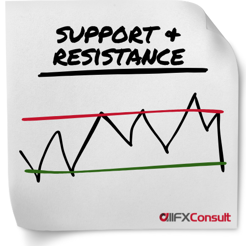
Chart Patterns
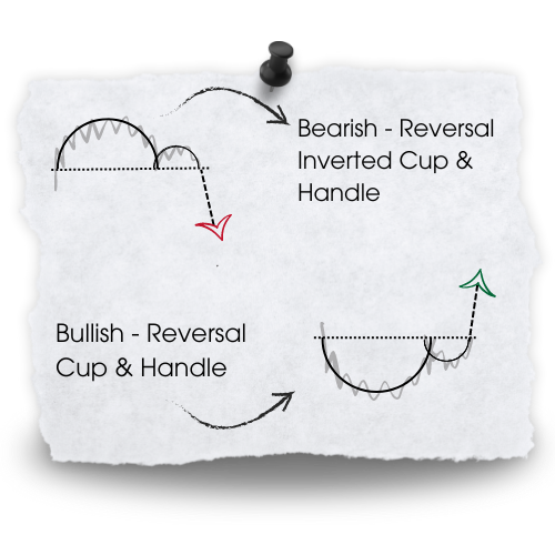
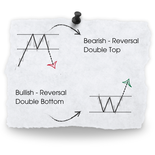
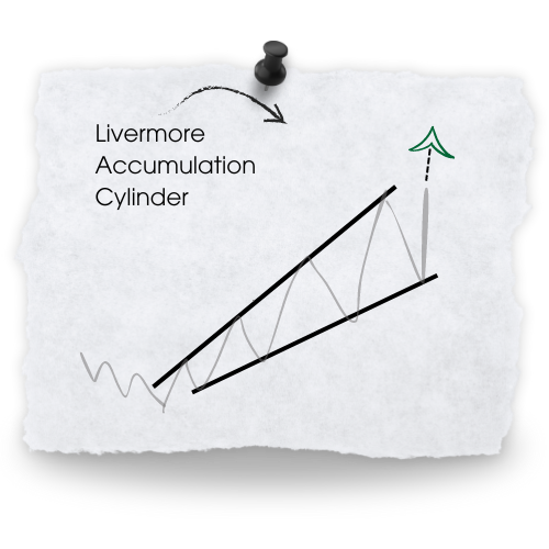
These repeating formations, help traders predict whether a prevailing trend will continue or reverse.
What else do they help with?
Those that might continue or reverse
With a pattern formed, risk can be managed
Fine tune entry and exit points
Stronger when combined with other analysis
History tends to repeat itself
A systematic way to analyze and learn
Common chart patterns
Candlestick Patterns
They represent the fight between buyers and sellers
They indicate reversal, continuation and indecision
Reversals
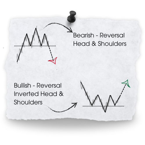
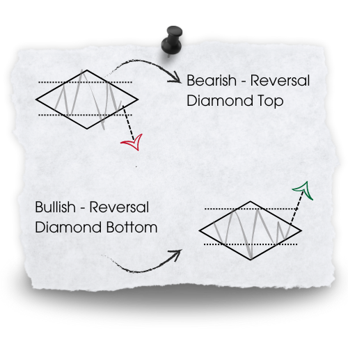
Reversal patterns indicate a potential shift in the current trend direction, up or down
Continuation
Continuation patterns indicate consolidation (or rest), that won’t affect the trend
Indecision
Indecision patterns show the struggle between buyers/sellers. Winner, chooser
Examples of single and double candle patterns
Back-testing
No one can predict with 100% accuracy where the market will head next, so learning how to formulate a strategy might need an extra layer of protection, and it comes in the form of back-testing.
Back-testing works by using historical price data to simulate the performance of a new trading strategy. This can be a manual or automated process using software, and it can help evaluate the potential effectiveness before going live.
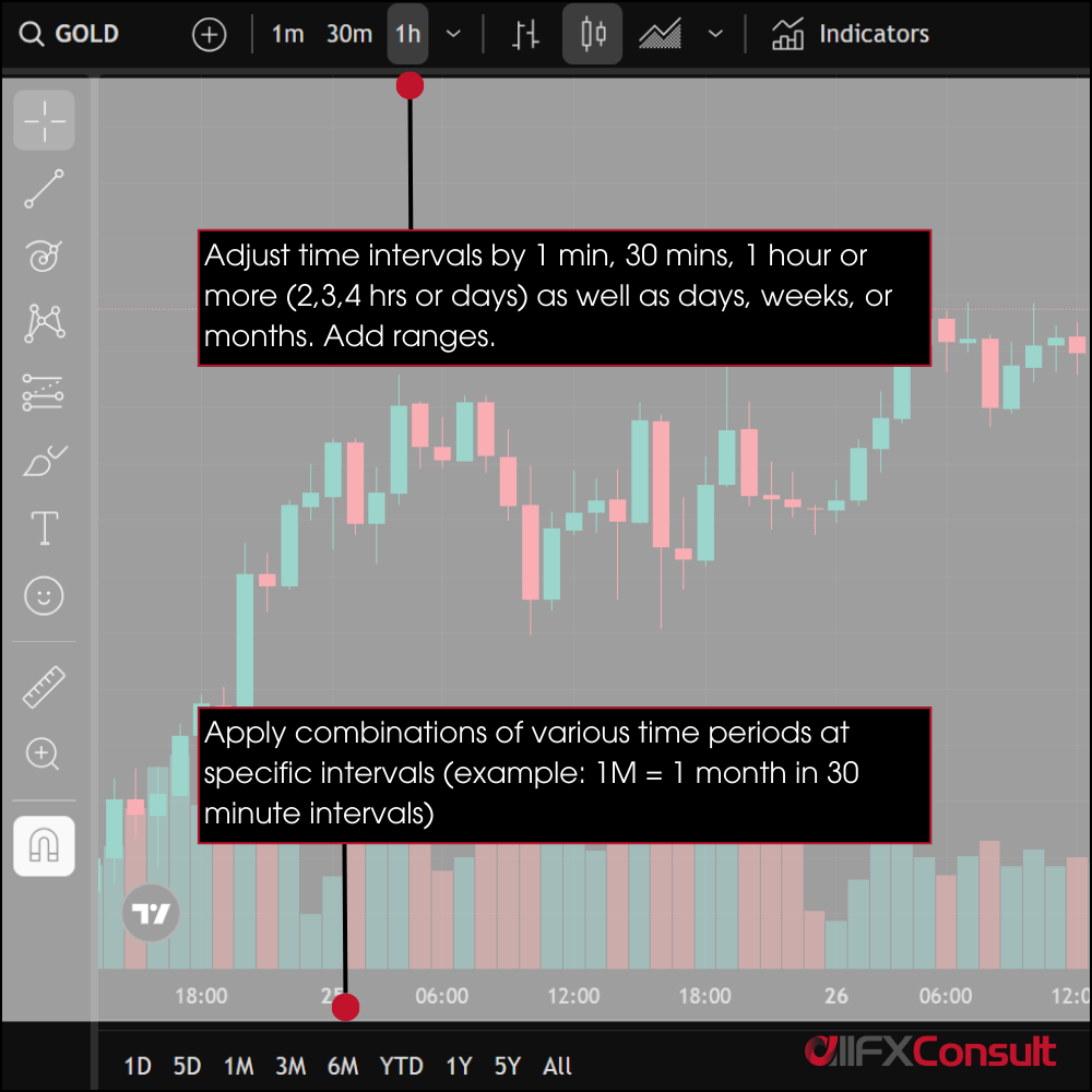
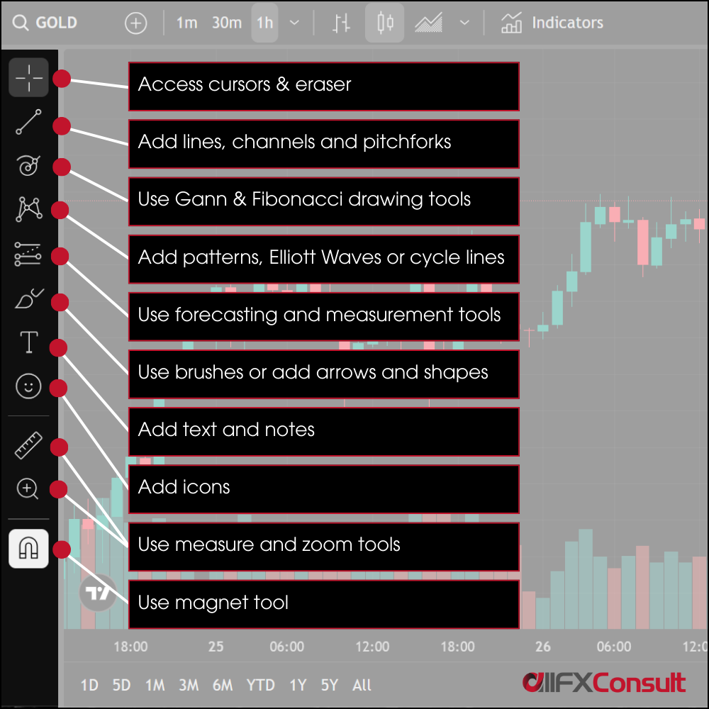
The goal can never be perfection, but optimization to maximize strengths and minimize weaknesses in the strategy. Below are examples of manual and automated ways to back-test on the TradingView platform.
Manual
Enable the Replay tool, select a starting point in the past, use the playback controls to move through past moves, and execute trades based on your strategy (as you would if you were live).
Automatic
There are three ways to use the Pine Script tool to create a strategy.
Code a strategy from scratch yourself
Load one from the trading community, or one you found from your network
Use AI to create one for you
The platform will automatically run the strategy on past data and provide results in the “Strategy Tester” panel, with details. You can then optimize the parameters to see how it affects profitability ratios, drawdowns, winning vs losing entries.
Paper trading (also known as forward testing) is similar, but done in real-time market conditions without risking money. Most trading platforms offer paper trading accounts where you can practice executing trades, tracking results, and refining your strategy.
When back-testing or paper trading, its wise to keep a log or trading journal. Make a record of every trade, why you entered, why you chose to exit, and the indicators used.
Working tirelessly on bringing you
snippets, videos, editorial on all things trading
Finding the right broker is not so simple
But when the match is found, the possibilities are endless


Thinking of monetizing your network?
Thoughts, questions, support?
Our team is available 24/7


