
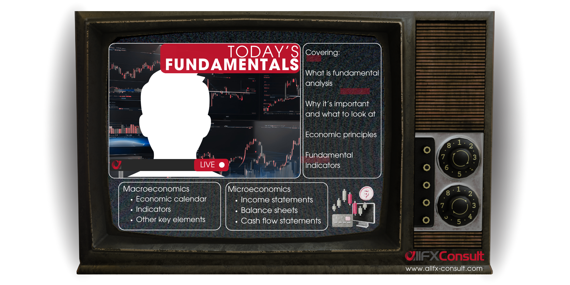
Fundamental analysis takes its turn?
LEARN with us, one element at a time


What do Benjamin Graham, David Dodd and Warren Buffett have in common?
Graham and Dodd wrote the book “Security Analysis”, popularized in 1934 and later championed by Buffett, establishing fundamentals as a cornerstone for value investing
Fundamental analysis is the way traders analyze factors other than price action, to examine an asset’s “real value”.
Real value, true value, fair value, they all mean the same thing. In fundamental terms, this is referred to as “intrinsic value”.
The end goal?
- To help traders predict the influence of these factors on future price moves
- To uncover if an asset is traded fairly, compared to its intrinsic value
Instead of looking at charts and historical prices, fundamental analysts look at external events and real-world factors like politics, geopolitics, economic indicators, industry trends, as well as the financial statements of companies.
Fundamental analysis has multiple benefits
and multiple limitations
Cuts through the noise
Stops reactions on every tick, due to wider narratives
Medium-long term vision
Prices do their thing, fundamental keeps us grounded
Deeper understanding
Reveals why assets move, reduces emotional decisions
Lagging data
Released periodically, prices move before data speak
Unpredictability
Politics, corporate news, scandals, weather, economics
Complexity
Too many things to look into, learning can get complex
Understanding the intrinsic value
When calculating the intrinsic value
one of three results is derived:
The asset is overvalued
Market price > Intrinsic value
The asset is undervalued
Market price < Intrinsic value
The asset is traded fairly
Market price close to Intrinsic value
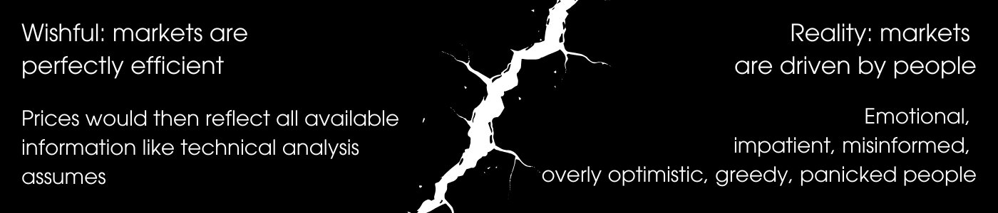
We’re only human
here’s how the human element, justifies the logic
New to trading?
Visit our beginner section

Fundamental analysis can be applied on any asset
With stocks, it can be conducted in two ways

Top-down fundamental analysis
Taking the bigger picture first, a broader view of the economy before narrowing it down to sectors and finally a specific company.

Bottom-up fundamental analysis
Taking a company’s financial metrics, and broadening out to sectors and exogenous factors that could affect the price.
Quantitative?
Qualitative?
or both?
fundamental factors distinguished by measure
Quantitative = asset metrics
Asset metrics = market cap, financial statements, ROIs, macro indicators, ratios for price/liquidity, efficiency, leverage, competitor metrics
Qualitative = status elements
Status elements = governance, management, compliance, brand recognition, reviews, news, ESG, innovation, business model, competition
Basic economic principles
The core of an economy
When markets (people) want a product or service, they buy. The more they buy, the more demand they create. As demand increases on the same supply numbers, so does the price.
When markets (people) don’t want as much a product or service, they don’t buy. The less they buy, the less demand they create. As demand lowers on the same supply numbers, so does the price.
Equilibrium occurs when demand meets supply. The shifts are dynamic, pushing the equilibrium up or down to meet the current market conditions.
Important: Real markets are not that accurate. Expectations, sentiment, speculation, can change these forces.
For example: oil prices can spike because traders think supply might tighten due to geopolitics or other reasons. Supply though in this example, remained unchanged.
Inflation is the result of an overheating economy or extreme conditions like intense geopolitics, wars and pandemics. These are all events we witnessed first hand in our life time with the COVID 19 pandemic and the war in Ukraine.
When the price of goods and services increases in the context of supply and demand, inflation is tamed. But when it runs away (runaway inflation) past the mark of 2%, inflation can become a problem.
Disinflation occurs when inflated prices of goods and services, are in a decreasing mode.
Deflation occurs when inflation turns negative (drops below 0). Also an extreme condition, because the 2% inflation level is needed for company margins and economic growth.
Inflation erodes salaries, profits and buying power. Left unchecked, people’s standards of living are becoming fragile, and spilling over into other parts of the economy.
The mandate of central banks is to maintain high employment, with an inflation target of 2%. But, high employment means people have spending power which counteracts the inflation measures.
A balance must be achieved to start the disinflation process, without damaging employment.
Economies like anything else organically structured, move in cycles. These cycles are more prominent during times of crisis, which we all know as recessions. Periods of extreme recessions, lead to depressions like in the case of the 1930s.
The four main cycles are expansion, peak, contraction and trough.
Expansion: economies are thriving, businesses grow, full employment, spending increases
Peak: growth is still present but hits a limit, economies overheat, inflation rises, credit tightens
Contraction: credit tightens more, activity slows, risky assets decline, companies cut costs
Trough: inflation is controlled, credit slowly increases, there’s pessimism but also opportunities
Traders look for these cycles, but also the transitions. Indicators can help with this, like consumer spending, market sentiment, manufacturing data, interest rate policies.
Transition examples
Late expansion: Defensive sectors and commodities often strengthen.
Early contraction: Safe-haven assets and bond markets attract attention.
Trough phase: Growth stocks and risk assets begin to recover before the economy fully does.
Early expansion: Cyclical sectors like tech, consumer goods, and industrials start gaining traction.
Central Bank policies
Central Banks manage a country’s monetary system. More than that though, their responsibility is to keep the economic cycles in check. The case of the 1930’s depression was an extreme case, that showed that without intervention, these cycles can spiral out of control.
Keynesian economics started a “global government movement”, that enforced mandates to control inflation and unemployment, in order to stabilize the financial system, guide growth and put a brake on recessions. All by controlling money supply in an economy.
The markets respond to these government policies, but also in the central bank’s remarks on how they see these playing out in the near future (forward guidance).
The policies:
Quantitative Easing (QE): Opening access to money, by lowering interest rates to make credit affordable. At the same time, they directly inject money, via the purchase of financial assets.
Quantitative Tightening (QT): Restriction of access to money, by increasing interest rates to make money expensive. They remove money from the economy, via the sale of financial assets.
Important note:
Both QE and QT can be tamed or aggressive. Traders don’t just hear QE or QT and respond. They watch the pace with which governments apply the policies in line with other factors.
Forward guidance: After their meeting, central banks publicise the decision making process and what numbers affected these decisions. They also hint, how they see future policy playing out.
Markets are more inclined to move strongly on future pricing, than the present. The idea is that the present is already somewhat reflected, but hints of the future are still a fair game.
Fundamental Indicators
macroeconomic and microeconomic metrics


Understanding macroeconomics
and how to read the indicators
Key areas of macroeconomic study:
Economic growth. Examining areas that increase or decrease a country’s output.
Inflation and price levels. Examining why prices increase or decrease in a system.
Unemployment. Examining why it rises or falls within the entire economy.
International trade. Examining trade balances, exchange rates and geo-partnerships.
Economic cycles. Recessions, expansions, peaks and troughs.
Government and Central Bank. Monetary and fiscal policies that control money supply.
An economic calendar is a schedule of important financial events, that acts as a financial alert system. All important announcements are listed by date/time, and includes previous, forecasts and actual numbers upon release.
Bigger moves are expected, when the released numbers deviate a lot from the expected forecast.
Most important macro indicators
Classified by leading/lagging, importance score, definition, formula, key trader considerations
Gross Domestic Product (GDP)
Type: Lagging
Importance Score: 10
Release Timing: Quarterly, 1–2 months after period end
Gross Domestic Product (GDP) is the broadest measure of economic activity and represents the total value of all goods and services produced within a country over a specific period, usually quarterly or annually. Traders watch GDP because it reflects the overall economic health of a nation and influences expectations of interest rates, corporate earnings, currency strength, and capital flows.
Definition
GDP measures the size and growth rate of an economy. A rising GDP suggests expansion, increasing demand, job creation, and business confidence.
Falling GDP signals slower activity, recession risk, or weakening consumption.
Formulas:
GDP is measured in three primary ways:
Expenditure Approach | GDP = C + I + G + (X-M)
Where:
- C = Consumption
- I = Investment
- G = Government Spending
- X – M = Net Export
Income Approach | GDP = Wages + Rent + Interest + Profits
Value Added Approach | GDP = Sum (Value Added)
Why It Matters to Traders
GDP reports can create immediate volatility in currencies, stock indexes, government bonds, and commodities, especially when the actual numbers differ from expectations.
- Currencies: Strong GDP usually strengthens the domestic currency.
- Equities: A healthy GDP boosts earnings expectations and equity demand.
- Bonds: Strong GDP can push yields higher due to inflation and rate expectations.
- Commodities: Solid growth supports oil, industrial metals, and energy demand.
GDP is a lagging indicator, but it significantly shapes long-term macro trends, making it one of the most important global indicators.
Consumer Price Index (CPI)
Type: Lagging
Importance Score: 10
Release Timing: Monthly, mid-month
The Consumer Price Index (CPI) measures inflation by tracking changes in the prices of a basket of goods and services that households purchase. It is one of the most market-moving indicators globally because inflation directly affects central bank policy, consumer buying power, corporate profitability, and currency value.
Definition
CPI shows how much the general cost of living has increased or decreased over time. Higher CPI means prices are rising; lower CPI suggests inflation is cooling.
Central banks use CPI as a primary benchmark for setting interest rates.
Released in 2 types:
Headline CPI: The total Consumer Price Index, which reflects price changes for all goods and services in a typical household’s basket. Problem is that items like food and energy are volatile, and including them might distort inflation outlooks. What if they were excluded?
Core CPI: A measure of underlying inflation, that excludes the most volatile components of food and energy, that have unpredictable price swings. Provides a better picture of persistent inflation trends. Central banks and governments pay attention to guide their monetary policy and interest rate decisions.
Formula
CPI = (Basket cost in current period / basket cost in base period) x 100
Inflation Rate (YoY):
Inflation = [ (CPIt – CPIt-12) / CPIt-12 ] x 100
Related Indicators
- PPI (producer inflation feeds into consumer inflation)
- Wage growth
- Import/Export prices
- Energy prices
CPI drives interest rate decisions. When inflation rises above central bank targets (often 2%), policymakers may raise rates to cool the economy.
When CPI falls, they may cut rates to stimulate activity.
Market reactions often include:
- Currencies: Higher CPI, stronger currency due to rate hike expectations
- Stocks: High inflation may depress equities; low inflation supports growth sectors
- Bonds: CPI spikes raise yields; falling CPI supports bond prices
- Commodities: Inflation typically boosts gold and real assets
CPI surprises (numbers significantly above or below forecasts) cause major intraday volatility.
Producer Price Index (PPI)
Type: Leading
Importance Score: 8
Release Timing: Monthly, mid-month
The Producer Price Index measures the average change in prices received by domestic producers for their output (manufacturing inflation). It is considered a leading indicator because changes in producer prices often translate into later changes in consumer prices.
Definition
PPI shows inflationary pressures in the early stages of production. If factory and wholesale prices rise, companies may eventually pass those costs to consumers, raising CPI.
Formula
[ ASP (current period) / ASP (base period) ] x 100
Where ASP = Average Selling Price
Related Indicators
- CPI (directly influenced by PPI trends)
- PMI manufacturing price components
- Import/export price indices
- Wage inflation
Why PPI Matters
- Currency markets: Rising PPI can strengthen a currency if it signals future inflation and rate hikes.
- Equities: High PPI pressures profit margins, hurting manufacturing-heavy sectors.
- Bonds: Higher PPI leads to expectations of higher CPI therefore higher yields.
- Commodities: PPI often rises with commodity booms (oil, metals).
PPI doesn’t move markets as sharply as CPI but is important for predicting inflationary trajectories.
Unemployment Rate
Type: Lagging
Importance Score: 10
Release Timing: Monthly, early in month
The unemployment rate measures the percentage of the labor force that is jobless and actively seeking work. Labor market strength is essential for understanding consumer demand, inflation pressure, economic growth, and central bank policy.
Definition
A low unemployment rate suggests a tight labor market. This leads to increased wage pressures, companies struggle to fill roles, and inflation may rise. High unemployment signals weakness, low consumer spending, and recession risk.
Formula
( Unemployed workers / labor force ) x 100
Related Indicators
- Non-Farm Payrolls (NFP)
- Participation rate
- Wage growth
- Job openings
- PMI employment components
Why It Matters
Employment is the backbone of economic growth. Central banks monitor labor market strength closely when determining interest rate paths:
- Strong labor can lead to an overheated economy and potential rate hikes
- Weak labor signals a cooling economy and potential rate cuts
Market reactions:
- FX: Strong labor, stronger currency
- Stocks: Strong labor, cyclical sector boost
- Bonds: Strong labor, yields rise on inflation expectations
- Gold: Weak labor, gold rises as safe haven
The unemployment rate has enormous long-term importance.
Non-Farm Payrolls (NFP)
Type: Leading
Importance Score: 10
Release Timing: Monthly, first Friday
Although specific to the U.S., NFP is one of the most watched indicators in global markets because the U.S. dollar is the world’s reserve currency.
NFP measures monthly changes in employment excluding farms, government, nonprofits, and private households.
Definition
NFP reveals hiring trends, wage pressure, labor demand, and economic momentum. It is often the most volatile major economic release and can generate massive intraday market reactions.
Formula
Reported directly as net jobs added.
NFP Change = Total Non-Farm Jobst – Total Non-Farm Jobst-1
Wage growth uses:
Wage Growth (YoY) = [ (Wt – Wt-12) / Wt-12 ] × 100
Related Indicators
- Unemployment rate
- Average hourly earnings
- Labor force participation rate
- JOLTS job openings
- ADP employment report
Why It Matters
NFP affects:
- Currencies: Huge moves in USD pairs occur within seconds
- Stocks: Strong NFP boosts risk sentiment; too strong raises rate fears
- Bonds: Strong jobs lead to higher yields
- Gold: Often reacts inversely to USD
Traders consider NFP a “super-indicator” due to its immediate global impact.
Purchasing Managers Index (PMI)
Type: Leading
Importance Score: 9
The Purchasing Managers Index (PMI) is one of the most influential leading indicators for forecasting economic activity because it measures conditions directly from business managers responsible for ordering materials, hiring staff, and planning production.
PMI surveys cover manufacturing and services sectors. Together they represent most of global GDP. The index gives an early signal of expansion, contraction, supply chain stress, demand strength, and price pressures.
Definition
PMI is a diffusion index ranging from 0 to 100:
- >50 signals expansion
- <50 signals contraction
- =50 signals no change
The index summarizes:
- New orders
- Output
- Employment
- Inventories
- Supplier delivery times
- Price trends
Formula
PMI is not a mathematically pure formula but a weighted diffusion index:
PMI = (P1 × W1) + (P2×W2) + … + (Pn × Wn)
Where
P = percentage of respondents reporting improvement
W = weight of each component.
Related Indicators
- Industrial production
- GDP (PMI predicts GDP movements 1–3 months ahead)
- PPI and CPI (price input/output components)
- Employment reports
- Business confidence indices
Why It Matters to Traders
PMI often moves markets immediately because it is one of the earliest monthly indicators.
- FX: Stronger PMI strengthens the domestic currency.
- Stocks: strong PMI boosts cyclical stocks; weak PMI lifts defensive sectors.
- Bonds: Weak PMI supports bond markets as growth expectations fall.
- Commodities: PMI correlates with industrial metals and energy demand.
Because PMI is forward-looking, traders treat it as one of the most reliable early-warning signals for recessions or expansions.
Retail Sales
Type: Leading
Importance Score: 9
Retail Sales measures the total value of goods sold by retailers and is a major indicator of consumer spending. It is often the largest component of GDP in developed nations.
Because households drive most economic activity, Retail Sales is a powerful gauge of demand strength and future economic momentum.
Definition
Retail Sales represent broad consumer demand across categories like clothing, electronics, groceries, and online sales.
- Rising retail sales suggest healthy consumption, job security, and income stability.
- Falling retail sales imply weakening consumer confidence and slower economic growth ahead.
Formula
Reported as percentage changes (MoM and YoY):
Retail Sales Change = [ (RSt – RSt-1) / RSt-1 ] × 100
Where RS = retail spending
Related Indicators
- Consumer confidence
- GDP (consumption component)
- Inflation (CPI)
- Employment and wages
- Personal income
Why It Matters to Traders
Retail Sales tends to create short-term volatility due to its strong relationship with GDP.
- FX: Higher retail sales boost the currency.
- Equities: Consumer discretionary stocks respond strongly; weak data benefits defensive sectors.
- Bonds: Strong retail sales reduce bond prices due to inflation/interest rate expectations.
- Commodities: Higher consumption supports oil and energy demand.
Retail Sales is especially powerful when it diverges sharply from expectations, making it a central release on most economic calendars.
Industrial Production
Type: Coincident
Importance Score: 8
Industrial Production measures the output of factories, utilities, and mining operations. It captures real activity in the production economy. This is one of the earliest places to see economic slowdowns or accelerations.
Because manufacturing sits upstream from retail, trade, and services, changes in industrial production often ripple into other economic sectors.
Definition
Industrial Production tracks physical output, not revenue. It measures how much is produced relative to the previous month, providing a direct gauge of economic momentum in manufacturing, energy consumption, and mining.
Formula
Industrial Production Change = [ (IPt – IPt-1) / IPt-1 ] × 100
Related Indicators
- PMI Manufacturing
- Capacity utilization
- Factory orders
- Export data
- Commodity prices
Why It Matters to Traders
Although manufacturing is smaller than services in developed nations, it remains central in global supply chains.
- FX: Strong output strengthens the currency, especially for export-heavy countries (Germany, Japan, South Korea).
- Equities: Industrial, material, and energy stocks react sharply.
- Bonds: Rising production raises inflation expectations.
- Commodities: Oil, copper, and other industrial metals respond heavily.
Industrial Production is particularly important in cyclical economies and is a reliable indicator of economic turning points.
Trade Balance (Exports – Imports)
Type: Lagging
Importance Score: 8
Release Timing: Monthly, mid-month
The Trade Balance measures the difference between a country’s exports and imports. A surplus occurs when exports exceed imports; a deficit occurs when imports exceed exports.
This indicator is fundamental to currency valuation because it reflects foreign demand for a country’s goods, services, and currency.
Definition
A positive trade balance (surplus) strengthens the currency as foreign buyers must purchase it to pay for exports. A negative balance (deficit) may weaken the currency because more domestic currency is sold to buy foreign goods.
Formula
Trade Balance = X – M
Where:
- X = exports
- M = imports
Related Indicators
- Current account
- Exchange rates
- Industrial production
- GDP (net exports component)
- PMI export orders
Why It Matters to Traders
Trade Balance heavily influences foreign exchange markets:
- Surpluses strengthen currencies (e.g., CHF, JPY).
- Deficits weaken currencies (e.g., often USD).
It also influences stock markets. Strong exports benefit industrials, autos, technology, and resource companies.
Commodities are also sensitive:
- Oil importers see trade deficits worsen as oil prices rise.
- Commodity exporters benefit from high commodity prices.
Although lagging, the Trade Balance helps traders understand economic competitiveness, currency strength, and global capital flows.
Current Account Balance
Type: Lagging
Importance Score: 8
Release Timing: Quarterly, 1–2 months after period end
The Current Account measures a country’s trade in goods and services, net income flows (interest, dividends), and transfer payments. It provides a comprehensive view of a nation’s financial interactions with the world and reflects whether a country is a net lender or borrower globally.
Definition
A current account surplus means a country saves more than it invests domestically, while a deficit means it imports more goods, services, or capital than it exports.
Formula
Current Account = ( Exports – Imports) + Net Income + Transfers
Related Indicators
- Trade balance
- Capital flows
- Exchange rates
- Foreign reserves
- GDP
Why It Matters to Traders
The Current Account is closely watched because persistent deficits can pressure a currency and increase reliance on foreign capital. Surpluses strengthen currencies and often occur in export-driven economies like Germany, China, and Japan.
Market impacts:
- FX: Largest impact, especially in emerging markets.
- Equities: Strong account supports business stability.
- Bonds: Deficits may raise yields due to funding needs.
- Commodities: Export-heavy countries are sensitive to commodity cycles.
It is a cornerstone of long-term macro evaluation.
Interest Rates
Type: Leading
Importance Score: 10
Central bank policy rates are among the most market-moving global indicators. They set the benchmark cost of borrowing in an economy and influence lending rates, consumer spending, business investment, inflation, and currency strength.
Examples include the Federal Funds Rate (US), ECB Main Refinancing Rate, BOE Bank Rate, and Bank of Japan Rate.
Definition
The policy rate is the interest rate at which commercial banks can borrow from the central bank.
It guides monetary conditions and is used to control inflation and stimulate or slow economic growth.
Formula
There isn’t a single formula, but the rate influences other rates via:
iloan ≈ ipolicy + risk premium + term premium
Central banks set targets for inflation and employment; interest rate decisions are based on a Taylor Rule approximation:
it = r* + πt + 0.5(πt – π*) + 0.5(yt – y*)
Where:
- r* = neutral real rate
- πt = current inflation
- π* = target inflation
- yt = actual output
- y* = potential output
Related Indicators
- CPI and PPI (inflation)
- GDP growth
- Unemployment and labor markets
- Yield curve and bond prices
Why It Matters to Traders
- FX: Central bank rate hikes strengthen the currency; cuts weaken it.
- Equities: Rate hikes can depress stocks, especially growth sectors; cuts are supportive.
- Bonds: When interest rates rise, bond prices fall and vice versa.
- Commodities: Higher rates increase opportunity cost of holding commodities; weaker for gold.
Announcements often trigger sharp intraday moves. Markets trade expectations, not just actual rate decisions.
Consumer Confidence Index (CCI)
Type: Leading
Importance Score: 8
Release Timing: Monthly, mid-month
The Consumer Confidence Index measures how optimistic or pessimistic households feel about the economy, employment, income, and spending.
Since consumer spending accounts for the majority of GDP in most developed countries, confidence levels are highly predictive of future economic activity.
Definition
CCI ranges roughly from 0–200:
- Above 100 signals optimism, spending likely to rise
- Below 100 signals pessimism, spending may fall
It is compiled from household surveys asking about current conditions and future expectations.
Formula | CCI is a weighted average:
CCI=∑ (Pi × Wi)
Where:
Pi = percentage of positive responses
Wi = weight for each survey component.
Related Indicators
- Retail Sales (spending behavior)
- GDP (consumption component)
- PMI services sector
- Employment and wage growth
Why It Matters to Traders
- FX: Stronger consumer confidence often supports the currency.
- Equities: High confidence favors cyclical sectors (consumer discretionary, travel).
- Bonds: Rising confidence may pressure bond prices due to expected rate hikes.
- Commodities: Industrial metals and energy benefit from rising consumer sentiment.
CCI is forward-looking, providing an early indication of retail, consumption, and growth trends.
Business Confidence Index (BCI)
Type: Leading
Importance Score: 8
Business Confidence Index (BCI) measures corporate managers’ outlook on production, investment, hiring, and general economic conditions.
Positive business sentiment indicates planned expansion; negative sentiment hints at slower investment and potential layoffs.
Definition
BCI is derived from survey questionnaires targeting purchasing managers, CEOs, or CFOs.
Components often include expectations for sales, capital expenditure, employment, and inventory.
Formula
BCI = ∑ ( Ppositive – Pnegative )
Where P = percentage of positive/negative responses.
Related Indicators
- PMI Manufacturing and Services
- GDP growth
- Retail sales
- Industrial production
Why It Matters to Traders
- FX: Positive business sentiment supports domestic currency.
- Equities: Corporate optimism drives capital expenditures and earnings projections.
- Bonds: Rising confidence may raise yields due to growth and inflation expectations.
- Commodities: Increased investment signals higher industrial demand.
BCI is especially important in economies with large export sectors because corporate sentiment often predicts trade flows.
Manufacturing Orders / Factory Orders
Type: Leading
Importance Score: 7
Manufacturing Orders track the total value of new purchase orders received by manufacturers, reflecting demand for future production.
They are a leading indicator of industrial production, GDP, and trade balance.
Definition
Orders are tracked monthly and include durable and non-durable goods.
Rising orders suggest expanding production, investment, and labor demand.
Declining orders indicate contraction.
Formula
Orders Change (%) = (Orderst – Orderstt-1) / Orderst-1) × 100
Related Indicators
- Industrial Production
- PMI New Orders
- GDP manufacturing component
- Trade balance
Why It Matters to Traders
- FX: Strong orders support domestic currency through expected growth.
- Equities: Manufacturing-heavy sectors (autos, machinery, electronics) react strongly.
- Bonds: Rising orders may trigger yield increases due to anticipated inflation.
- Commodities: Steel, metals, and energy demand correlate with manufacturing orders.
This indicator is forward-looking because it reflects anticipated production and investment before output actually occurs.
Housing Starts / Building Permits
Type: Leading
Importance Score: 8
Release Timing: Monthly, mid-month
Housing Starts measure the number of new residential construction projects begun in a month.
Building Permits track approved future construction. Both are vital for understanding consumer confidence, employment in construction, materials demand, and overall economic activity.
Definition
- Housing Starts: Initiated new residential buildings
- Building Permits: Approved future construction
Residential construction is a leading driver of employment, durable goods consumption, and GDP.
Formula
Change (%) = (Current Month – Previous Month) / Previous Month ×100
Related Indicators
- Retail sales of home-related goods
- Construction employment
- Mortgage rates
- GDP residential investment component
Why It Matters to Traders
- FX: Strong housing data supports the currency via economic growth expectations.
- Equities: Construction, materials, and home improvement sectors benefit.
- Bonds: Rising housing can trigger rate expectations if inflation risk increases.
- Commodities: Lumber, steel, and copper prices often move with housing data.
Housing data is a forward-looking indicator because it predicts future construction activity and spending, making it highly watched in economic calendars.
Producer Confidence / Business Survey Indices
Type: Leading
Importance Score: 7
Producer Confidence (also called Business Survey Indices in some countries) measures the outlook of manufacturers and other producers regarding production, orders, investment, and employment.
It is forward-looking and signals potential changes in industrial activity and GDP growth.
Definition
These surveys ask respondents to rate:
- Production expectations
- Order backlogs
- Inventory levels
- Employment intentions
- Capital expenditure plans
High producer confidence suggests expanding production, while low confidence implies caution or contraction.
Formula
Typically calculated as a diffusion index:
- Index > 100 indicates expansion
- Index < 100 indicates contraction
Related Indicators
- PMI Manufacturing (often correlates closely)
- Industrial Production
- GDP growth
- Trade balance
Why It Matters to Traders
- FX: Strong confidence signals stronger currency due to expected growth.
- Equities: Industrial, manufacturing, and cyclical sectors are most sensitive.
- Bonds: Rising confidence may increase yields via growth expectations.
- Commodities: Metals and energy see demand forecasts reflected in sentiment.
Producer confidence is watched as an early warning signal of economic acceleration or slowdown.
Durable Goods Orders
Type: Leading
Importance Score: 7
Release Timing: Monthly, mid-month
Producer Confidence (also called Business Survey Indices in some countries) measures the outlook of manufacturers and other producers regarding production, orders, investment, and employment.
It is forward-looking and signals potential changes in industrial activity and GDP growth.
Definition
These surveys ask respondents to rate:
- Production expectations
- Order backlogs
- Inventory levels
- Employment intentions
- Capital expenditure plans
High producer confidence suggests expanding production, while low confidence implies caution or contraction.
Formula
Typically calculated as a diffusion index:
- Index > 100 indicates expansion
- Index < 100 indicates contraction
Related Indicators
- PMI Manufacturing (often correlates closely)
- Industrial Production
- GDP growth
- Trade balance
Why It Matters to Traders
- FX: Strong confidence signals stronger currency due to expected growth.
- Equities: Industrial, manufacturing, and cyclical sectors are most sensitive.
- Bonds: Rising confidence may increase yields via growth expectations.
- Commodities: Metals and energy see demand forecasts reflected in sentiment.
Producer confidence is watched as an early warning signal of economic acceleration or slowdown.
Jobless Claims / Initial Unemployment Claims
Type: Leading
Importance Score: 8
Jobless claims measure the number of people filing for unemployment benefits for the first time. This weekly release is a leading indicator of labor market trends, consumer spending, and economic momentum.
Definition
- Initial claims: New claims filed in a week
- Continuing claims: Total ongoing unemployment benefits
Fewer claims indicate a strong labor market; rising claims indicate weakness.
Formula
No complex formula. Simply the reported number of claims. Often expressed as a rolling 4-week average to smooth volatility:
4-week average = (Week1 + Week2 + Week3 + Week4) / 4
Related Indicators
- Unemployment rate
- Non-Farm Payrolls
- Consumer confidence
- Retail sales
Why It Matters to Traders
- FX: Strong labor market reduces unemployment, supporting currency.
- Equities: Fewer claims boost consumer-driven sectors.
- Bonds: Rising claims can push yields lower due to expected monetary easing.
- Commodities: Indirectly affects consumption-sensitive commodities.
Weekly frequency makes it a high-impact, early signal for labor trends, often moving markets quickly, especially in the US.
Average Hourly Earnings / Wage Growth
Type: Leading
Importance Score: 9
Average Hourly Earnings track wage changes for employees. Wage growth is critical because it feeds directly into inflation, consumer spending, and corporate costs.
Rising wages can signal a tightening labor market, higher consumption, and potential interest rate hikes.
Definition
Wage growth shows how much pay increases over time, usually monthly or yearly, adjusted for seasonal factors.
Central banks monitor wages as part of their inflation outlook.
Formula
Wage Growth (% YoY) = (AHEt – AHEt-12) / AHEt-12) × 100
Wage Growth (% MoM) = (AHEt – AHEt-1) / AHEt-1) × 100
Where
AHE = Average Hourly Earnings
Related Indicators
- CPI (inflation correlation)
- Unemployment rate
- Non-Farm Payrolls
- Consumer spending
Why It Matters to Traders
- FX: Rising wages increase inflation expectations, strengthening currency.
- Equities: Moderate wage growth supports earnings; excessive growth may hurt margins.
- Bonds: High wages can push yields higher via inflation expectations.
- Commodities: Increased spending supports demand for goods and energy.
Wage growth is often a market-moving indicator, especially when paired with employment reports.
Manufacturing Output / Industrial Capacity Utilization
Type: Leading
Importance Score: 8
Manufacturing Output measures the physical production in factories, while Capacity Utilization shows what percentage of total potential output is actually used.
These indicators are leading because they reveal potential bottlenecks, inflation pressures, and future GDP trends.
Definition
- Manufacturing Output: Production volume changes
- Capacity Utilization: Actual Output / Potential Output × 100
High utilization may indicate growing demand and potential inflation.
Low utilization signals slack and slowdown.
Formula
Capacity Utilization (%) = (Actual Production / Maximum Possible Production) × 100
Manufacturing Output Change (%) = (Outputt Outputt-1) / Outputt-1) × 100
Related Indicators
- PMI Manufacturing
- Industrial Production
- Durable Goods Orders
- Inflation indicators (CPI/PPI)
Why It Matters to Traders
- FX: Strong output/usage supports currency due to economic growth.
- Equities: Industrial and cyclical sectors benefit.
- Bonds: Rising output may trigger higher yields if inflation risk rises.
- Commodities: Energy, metals, and industrial materials are sensitive.
Manufacturing Output and Capacity Utilization give early signals of economic expansion or contraction.
Services PMI
Type: Leading
Importance Score: 8
The Services PMI measures the economic activity in the services sector, which often constitutes the largest part of GDP in developed economies.
It surveys businesses on new orders, output, employment, and delivery times, providing insight into sectoral health.
Definition
Similar to Manufacturing PMI:
- >50 signals expansion
- <50 signals contraction
Because services dominate consumer spending, the index signals consumption trends and economic momentum.
Formula
PMI (Services) = ∑ (% positive + 0.5 × % neutral)
Related Indicators
- Retail Sales
- Employment / Jobless Claims
- Consumer Confidence Index
- GDP Services Component
Why It Matters to Traders
- FX: Positive Services PMI strengthens currency.
- Equities: Consumer-driven sectors (retail, hospitality, healthcare) respond strongly.
- Bonds: Rising services activity can push yields higher.
- Commodities: Less direct than manufacturing but can influence energy and industrial metals.
Services PMI provides an early view of the largest GDP segment, offering forward-looking signals for trading and economic expectations.
Consumer Credit / Private Sector Lending
Type: Leading
Importance Score: 7
Consumer Credit measures total borrowing by households, including credit cards, loans, and mortgages.
Private sector lending is a broader measure including business loans.
Both indicate spending capacity, financial health, and potential future consumption.
Definition
- Rising credit indicates higher consumer and business spending potential
- Falling credit suggests tightening, reduced consumption, and slower growth
Formula
Credit Growth (%) = [ Creditt – Creditt-1) / Creditt-1 ] x 100
Related Indicators
- Retail Sales
- Consumer Confidence Index
- CPI / Inflation
- Interest Rates
Why It Matters to Traders
- FX: Rising credit growth often supports currency via expected economic activity.
- Equities: Consumer-focused sectors benefit from increased borrowing.
- Bonds: Expanding credit may increase inflation expectations, affecting yields.
- Commodities: Energy and consumption-linked commodities respond indirectly.
Credit growth is forward-looking, signaling potential boosts or slowdowns in consumption and investment.
Construction Spending
Type: Leading
Importance Score: 7
Release Timing: Monthly, usually mid-month
Explanation
Construction Spending tracks total expenditures on residential, non-residential, and public construction projects.
It signals economic momentum because construction is capital-intensive and strongly linked to employment, raw materials demand, and consumer confidence.
Formula
Construction Spending (% MoM) = [ Spendingt – Spendingt-1) / Spendingt-1 ] × 100
Trading Relevance
- FX: Rising construction spending signals stronger domestic currency due to growth expectations.
- Equities: Construction, materials, and homebuilder stocks respond immediately.
- Bonds: Growth signals may push yields higher; slow spending may support bonds.
- Commodities: Steel, cement, lumber, and other construction materials see increased demand.
Notes
- Sensitive to weather and seasonal factors; seasonal adjustments are important.
- Often correlates with housing starts and permits.
Existing Home Sales
Type: Lagging / Coincident
Importance Score: 6
Release Timing: Monthly, usually mid-month
Existing Home Sales track the sale of previously owned homes.
Unlike housing starts, this reflects current economic conditions and consumer demand rather than future construction.
Strong sales indicate consumer confidence and credit availability; weak sales suggest tightening financial conditions or economic slowdown.
Formula
Sales Change (% MoM) = [ (Salest – Salest-1) / Salest-1) × 100
Trading Relevance
- FX: Strong sales signal moderate currency support.
- Equities: Real estate investment trusts (REITs) and housing-related stocks respond.
- Bonds: Rising home sales may indicate inflationary pressure driving yields up.
- Commodities: Indirectly affects lumber, appliances, and consumer goods.
Notes
- Sensitive to interest rates and mortgage availability.
- Often compared with New Home Sales for a comprehensive housing picture.
Mortgage Applications
Type: Leading
Importance Score: 6
Release Timing: Weekly, every Wednesday
Mortgage Applications track the number of new applications for home loans, including purchase and refinance requests.
This indicator reflects consumer demand for housing and borrowing conditions.
Rising applications suggest strong housing demand and confidence, while declines may indicate caution or higher interest rates.
Formula
Mortgage Applications Change (%) = [( Applicationst – Applicationst-1) / Applicationst-1) × 100
Trading Relevance
- FX: Rising mortgage applications can support the currency through expectations of stronger economic activity.
- Equities: Homebuilders, mortgage lenders, and REITs respond quickly.
- Bonds: Increased borrowing may affect bond yields; declining applications may increase bond demand.
- Commodities: Lumber, appliances, and home construction materials can be indirectly influenced.
Notes
- Highly sensitive to weekly interest rate changes and mortgage rates.
- Often considered a short-term leading indicator for housing starts and construction spending.
ISM Non-Manufacturing Index
Type: Leading
Importance Score: 8
Release Timing: Monthly, early in the month
The ISM Non-Manufacturing Index (Services PMI equivalent in the U.S.) measures business activity, new orders, employment, and supplier deliveries in the services sector.
Since services dominate the U.S. economy, it provides a near-real-time picture of growth and inflationary pressures.
Formula
ISM NMI = ∑ (% of positive responses + 0.5 × % of neutral responses)
- >50: Expansion
- <50: Contraction
Trading Relevance
- FX: Strong index signals USD appreciation due to growth expectations.
- Equities: Consumer services, tech, healthcare, and financials respond.
- Bonds: Rising activity signals that yields may increase; slowing activity signals that yields may decline.
- Commodities: Indirect impact, mainly via business activity and energy demand.
Notes
- Often paired with Manufacturing PMI for a complete picture of U.S. economic activity.
- Sensitive to economic shocks, policy changes, and consumer demand shifts.
Factory Orders
Type: Leading
Importance Score: 7
Release Timing: Monthly, mid-month
Factory Orders measure the total value of new orders placed with manufacturers for both durable and non-durable goods.
This indicator signals business demand and production trends, providing insight into industrial activity and future economic growth.
Formula
Factory Orders (% MoM) = [ (Orderst – Orderst-1) / Orderst-1) × 100
Trading Relevance
- FX: Rising orders signal currency support via expected economic growth.
- Equities: Industrials, machinery, and materials stocks benefit.
- Bonds: Strong orders may push yields higher; weak orders may drive yields lower.
- Commodities: Metals and energy prices react to increased industrial demand.
Notes
- Often analyzed with Durable Goods Orders and PMI for broader industrial trend insights.
- Sensitive to business cycle fluctuations and global demand.
Conference Board Leading Economic Index (LEI)
Type: Leading
Importance Score: 9
Release Timing: Monthly, end of month
The LEI aggregates ten leading indicators including unemployment claims, stock prices, building permits, and interest rate spreads.
The end goal is to predict economic trends over the next 6–12 months.
It is widely used to anticipate expansions and recessions.
Formula
LEI = Weighted Average of 10 Leading Indicators (standardized)
Trading Relevance
- FX: Rising LEI signals currency appreciation due to growth expectations.
- Equities: Broad market impact; cyclical sectors benefit during expected expansions.
- Bonds: Rising LEI may increase yields; falling LEI supports bonds.
- Commodities: Industrial commodities respond to forward-looking growth signals.
Notes
- Highly respected for recession forecasting.
- Strong predictive power when combined with PMI and employment trends.
Personal Income
Type: Leading / Coincident
Importance Score: 7
Release Timing: Monthly, usually end of month
Personal Income measures total earnings received by individuals, including wages, salaries, interest, dividends, and transfer payments.
Rising income signals higher consumer spending potential and economic growth. Falling income can reduce consumption and slow GDP growth.
Formula
Personal Income (% MoM) = [ (Incomet – Incomet-1) / Incomet-1 ] × 100
Trading Relevance
- FX: Higher income signals stronger currency through consumption-driven growth.
- Equities: Consumer discretionary, retail, and services sectors respond positively.
- Bonds: Rising income may increase inflation expectations which may cause yields to rise.
- Commodities: Energy and consumer goods may see higher demand.
Notes
- Often compared with Personal Spending to gauge household saving vs. spending behavior.
- Sensitive to labor market changes and fiscal policy.
Non-Durable Goods (Industrial Orders)
Type: Leading
Importance Score: 6
Release Timing: Monthly, mid-month
Industrial Orders for Non-Durable Goods track orders for products with short life spans, such as food, chemicals, and textiles.
They provide insight into current and near-term industrial activity and domestic demand.
Formula
Orders Change (% MoM) = [ (Orderst – Orderst-1) / Orderst-1 ] × 100
Trading Relevance
- FX: Rising orders signal currency support due to expected economic growth.
- Equities: Non-durable goods producers and industrial stocks benefit.
- Bonds: Strong order growth may pressure yields upward; weak growth supports bonds.
- Commodities: Chemicals, energy, and raw materials react to industrial demand.
Notes
- Often analyzed alongside durable goods orders for a complete industrial picture.
- Sensitive to supply chain disruptions and global demand shifts.
Understanding microeconomics
and how to read metrics and ratios
Earning seasons, reports and releases
Microeconomics in the context of the stock market, are based on company information, that are mandatory for publicly listed companies to disclose.
The information is audited and released on financial statements (online usually found on the “Investors Relations” page of the companies).
January, April, July and October are the months of the year that earnings reports are usually being released. These periods are known as earnings seasons.
Income Statement
Balance Sheet
Cash Flow Statement
- INCOME STATEMENT
- What is it?
- Why is it important?
- How do investors use it?
- What's in it?
- Metrics and ratios

An income statement (aka profit and loss statement) shows how much money a company earned and how much it spent over a specific period of time, usually a quarter or a full year.
In simple terms, it answers one core question:
Did the company make money during this period, and how?
The income statement follows a logical flow:
- Start with revenue (money coming in)
- Subtract costs and expenses
- End with net income (profit or loss)
An income statement shows performance over time, making it essential for trend analysis. Unlike the balance sheet which is a snapshot in time.
It helps investors understand:
- Profitability. Is the company profitable and is profit increasing or declining over time?
- Business Quality. Does the company generate strong margins and are costs well controlled?
- Growth. Is revenue growing and are profits growing faster or slower than revenue?
- Sustainability. Profits come from core operations or one-time events and is the model scalable?
Investors many times look at an income statement in isolation together with past releases to find patterns.
They use income statements to:
- Compare companies. Compare profit margins across competitors and assess which company runs a more efficient business.
- Analyze trends. Look at revenue, expenses, and profit over multiple periods and identify improving or deteriorating fundamentals.
- Examine valuations. Metrics like earnings per share (EPS) and price-to-earnings (P/E) rely on income statement data.
- Assess risk. Rising costs, shrinking margins, or volatile earnings.
| Income Statement Item | Amount |
|---|---|
| Revenue | 1000000 |
| Cost of Goods Sold (COGS) | -400000 |
| Gross Profit | 600000 |
| Operating Expenses | |
| Research & Development | 80000 |
| Sales & Marketing | 120000 |
| General & Administrative | 70000 |
| Total Operating Expenses | -270000 |
| Operating Income | 330000 |
| Interest Expense | -20000 |
| Earnings Before Taxes (EBT) | 310000 |
| Income Tax Expense (25%) | -77500 |
| Net Income | 232500 |
Revenue (Top Line)
Total money earned from selling goods or services.
Formula: Price × Quantity sold
- Indicates demand for the company’s products or services
Revenue growth is often the foundation of long-term value
Cost of Goods Sold (COGS)
Direct costs required to produce goods or deliver services.
Beginning inventory + production costs − ending inventory
- Shows how expensive it is to produce revenue
- Affects profitability directly
Gross Profit
Profit after covering direct production costs.
Revenue − COGS
Key related metric:
Gross Margin = Gross Profit ÷ Revenue
- Indicates pricing power and production efficiency
- Higher gross margins often signal a stronger competitive position
Operating Expenses
Costs required to run the business but not directly tied to production.
- Shows how management allocates resources
- Rapidly rising expenses without revenue growth can be a red flag
Common Categories:
- Research / Development: Product innovation and future growth
- Sales / Marketing: Customer acquisition and brand building
- General / Administrative: Management, accounting, legal, HR
Operating Income (Operating Profit)
Profit from core business operations.
Gross Profit − Operating Expenses
- Excludes financing and tax effects
- Reflects the health of the underlying business
Note: Many investors view operating income as one of the most important profit measures.
Interest Expense
Cost of borrowing money.
- High interest expense may indicate heavy debt
- Rising interest costs can reduce profitability and flexibility
Earnings Before Taxes (EBT)
Profit before government taxes.
Operating Income − Interest Expense
- Shows profitability before tax structure differences
- Useful for comparing companies across regions
Income Tax Expense
Taxes owed to governments.
EBT × Effective tax rate
- Can vary due to tax strategies, credits, or jurisdictions
- One-time tax effects should be analyzed carefully
Net Income (Bottom Line)
The company’s final profit after all expenses.
EBT − Taxes
- Determines earnings per share (EPS)
- Drives dividends and long-term shareholder value
Note: Net income is important. But how the company got there is equally critical.
Revenue (Sales)
Revenue = Price × Units Sold
Revenue Growth Rate
Current Period Revenue – Prior Period Revenue / Prior Period Revenue
Cost of Goods Sold (COGS)
COGS = Materials + Direct Labor + Production Costs
Gross Profit
Gross Profit = Revenue – COGS
Gross Margin
Gross Margin = Gross Profit / Revenue
Operating Expenses (Opex)
OPEX = R&D + S&M + G&A
Operating Income (Operating Profit / EBIT)
Operating Income = Gross Profit – Operating Expenses
Operating Margin
Operating Margin = Operating Income / Revenue
EBITDA
EBITDA = Operating Income + Depreciation + Amortization
Interest Expense
Interest Expense = Debt × Interest Rate
Earnings Before Taxes (EBT)
EBT = Operating Income – Interest Expense
Effective Tax Rate
Effective Tax Rate = Income Tax Expense / EBT
Net Income
Net Income = EBT – Taxes
Net Margin
Net Margin = Net Income / Revenue
Earnings Per Share (EPS)
EPS = Net Income / Weighted Avg Shares Outstanding

What is a balance sheet?
A balance sheet shows what a company owns, what it owes, and what belongs to shareholders at a specific point in time (for example, end of year).
It is built around one fundamental equation that must always balance (which is why the statement is called a balance sheet):
Assets = Liabilities + Shareholders’ Equity
Important difference from other financial statements:
- Income statement: Performance over time
- Balance sheet: Financial position at a moment in time
- Cash flow statement: Cash movement over time
Why is a balance sheet important?
The balance sheet answers important investor questions to reveals survivability.
- Financial strength. Does the company have enough assets to cover its obligations and how leveraged (debt) is the business?
- Liquidity. Can the company pay its bills in the short term and how much cash and cash equivalents does it have?
- Solvency & Risk. How dependent is the company on debt and what happens in an economic downturn?
- Capital Structure. How much of the business is financed by debt vs equity and is management using leverage responsibly?
How do investors use the balance sheet?
Investors know that profits can be manipulated in the short-term.
Balance sheets are harder to disguise over time. They use it to:
Assess Risk
- High debt = higher financial risk
- Weak liquidity = higher bankruptcy risk
Evaluate Capital Efficiency
- Are assets generating strong returns?
- Is equity being diluted unnecessarily?
Support Valuation
- Many valuation ratios depend on balance sheet data:
- Return on Equity (ROE)
- Return on Assets (ROA)
- Debt-to-Equity
Identify Red Flags
-
- Rapidly rising debt
- Shrinking cash reserves
- Negative equity
| Balance Sheet Item | Amount |
|---|---|
| Assets | |
| Current Assets | |
| Cash & Cash Equivalents | 150000 |
| Accounts Receivable | 120000 |
| Inventory | 100000 |
| Prepaid Expenses | 30000 |
| Total Current Assets | 400000 |
| Non-Current Assets | |
| Property, Plant & Equipment (PP&E) | 500000 |
| Intangible Assets | 200000 |
| Total Non-Current Assets | 700000 |
| Total Assets | 1100000 |
| Liabilities & Equity | Amount |
| Current Liabilities | |
| Accounts Payable | 130000 |
| Short-Term Debt | 70000 |
| Accrued Expenses | 50000 |
| Total Current Liabilities | 250000 |
| Long-Term Liabilities | |
| Long-Term Debt | 350000 |
| Total Liabilities | 600000 |
| Shareholders’ Equity | |
| Common Stock | 200000 |
| Retained Earnings | 300000 |
| Total Equity | 500000 |
| Total Liabilities + Equity | 1100000 |
ASSETS: What the Company Owns
Current Assets
Assets expected to be converted into cash within one year.
Cash & Cash Equivalents
Immediately available liquidity.
- Financial flexibility
- Downside protection
How it’s calculated:
- Bank balances
- Short-term government securities
Accounts Receivable (AR)
Money owed by customers.
- Indicates credit policy quality
- Rapid AR growth may signal collection issues
How it’s calculated: Revenue recognized but not yet collected
Inventory
Goods available for sale.
- Too much inventory can mean weak demand
- Too little can limit growth
How it’s calculated: Raw materials + work-in-progress + finished goods
Prepaid Expenses
Payments made in advance (rent, insurance).
- Minor, but part of working capital
How it’s calculated: Cash paid for future services
LIABILITIES: What the Company Owes
Current Liabilities
Obligations due within one year.
Accounts Payable (AP)
Money owed to suppliers.
- Indicates payment discipline
- Tied to cash flow management
How it’s calculated: Unpaid vendor invoices
Short-Term Debt
Borrowings due within one year.
- Liquidity risk
- Refinancing exposure
Accrued Expenses
Expenses incurred but not yet paid (wages, taxes).
- Reflects true short-term obligations
Long-Term Liabilities
Long-Term Debt
Loans and bonds due beyond one year.
- Leverage increases returns and risk
- High debt reduces flexibility in downturns
SHAREHOLDERS’ EQUITY: Owners’ Claim
Common Stock
Capital raised from issuing shares.
- Represents ownership base
- Excessive issuance dilutes shareholders
Retained Earnings
Cumulative profits reinvested in the business.
- Shows long-term profitability
- Indicates whether growth is internally funded
How it’s calculated: Prior Retained Earnings + Net Income – Dividends
Total Assets
Total Assets = Current Assets + Non-Current Assets
Current Assets
Current Assets = Cash + AR + Inventory + Prepaids
Current Liabilities
Current Liabilities = AP + Short-Term Debt + Accrued Expenses
Net Working Capital (NWC)
NWC = Current Assets – Current Liabilities
Current Ratio
Current Ratio = Current Assets / Current Liabilities
Quick Ratio (Acid-Test Ratio)
Quick Ratio = (Cash + Marketable Securities + AR ) / Current Liabilities
Cash Ratio
Cash Ratio = Cash + Marketable Securities / Current Liabilities
Total Debt
Total Debt = Short-Term Debt + Long-Term Debt
Net Debt
Net Debt = Total Debt-Cash and Equivalents
Debt-to-Equity Ratio
Debt-to-Equity = Total Debt / Total Equity
Debt-to-Assets Ratio
Debt-to-Assets = Total Debt / Total Assets
Shareholders’ Equity
Equity = Assets – Liabilities
Book Value per Share (BVPS)
BVPS = Total Equity / Shares Outstanding
Return on Assets (ROA)
ROA = Net Income / Average Total Assets
Return on Equity (ROE)
ROE = Net Income / Average Equity
Asset Turnover
Asset Turnover = Revenue / Average Total Assets
Tangible Book Value
Tangible Book Value = Equity – Intangibles
- CASH FLOW STATEMENT
- What is it?
- Why is it important?
- How do investors use it?
- What's in it?
- Metrics and ratios

What is a cash flow statement?
A cash flow statement shows how cash actually moves in and out of a company over a specific period (quarter or year).
It explains where cash came from, where it went, and how the cash balance changed.
Key difference with the other statements:
- Income statement measures profit
- Balance sheet shows financial position
- Cash flow statement answers a more fundamental question: is the company generating cash, and how is it using it?
Note: A company can report strong profits but still run out of cash. The cash flow statement reveals this risk.
The statement has three sections:
- Operating Activities: Cash from core business
- Investing Activities: Cash used to grow or shrink the business
- Financing Activities: Cash from owners and lenders
The cash flow statement is important because it:
- Measures Financial Reality. Cash is harder to manipulate than earnings, and it reveals earnings quality.
- Shows liquidity and survivability. Cash pays bills, debt, and dividends. It determines whether a company can survive downturns.
- Explains Balance Sheet Changes. Shows why cash, debt, or equity changed.
- Supports Valuation. Cash flow (not earnings) drives intrinsic value. It is used directly in Discounted Cash Flow (DCF) models.
Over the long term, stock prices follow cash flows, not accounting profits. Investors examine cash flow statements to:
Evaluate Earnings Quality
- Is profit backed by cash?
- Large gaps between net income and cash flow are red flags
Assess Business Health
- Is the core business self-funding?
- Is the company dependent on debt or equity raises?
Understand Capital Allocation
- How management invests, borrows, and returns capital
Measure Downside Risk
- Strong operating cash flow provides resilience
| Cash Flow Statement | |
|---|---|
| Cash Flows from Operating Activities | Amount |
| Net Income | 82500 |
| Depreciation & Amortization | 60000 |
| Change in Accounts Receivable | -20000 |
| Change in Inventory | -15000 |
| Change in Accounts Payable | 25000 |
| Net Cash from Operating Activities (CFO) | 132500 |
| Cash Flows from Investing Activities | Amount |
| Capital Expenditures (CapEx) | -90000 |
| Purchase of Intangible Assets | -20000 |
| Net Cash from Investing Activities (CFI) | -110000 |
| Cash Flows from Financing Activities | Amount |
| Debt Issued | 100000 |
| Debt Repaid | -40000 |
| Dividends Paid | -30000 |
| Net Cash from Financing Activities (CFF) | 30000 |
| Net Change in Cash | 52500 |
| Beginning Cash Balance | 97500 |
| Ending Cash Balance | 150000 |
| Ending cash must match the balance sheet |
Cash Flow from Operating Activities (CFO)
Cash generated (or used) by the company’s core business operations. A company with consistently positive CFO is generally healthier and lower risk.
- Indicates whether the business is self-sustaining
- Strong CFO is the most important cash flow metric
How It’s Calculated: Most public companies use the indirect method, which starts with net income and adjusts for:
- Non-cash expenses: Depreciation & amortization (added back)
- Working capital changes: Accounts receivable, inventory, accounts payable
Depreciation & Amortization
Non-cash accounting charges for asset usage. High D&A relative to CapEx can signal underinvestment.
Why added back:
- Reduced net income
- Did not use cash in the current period
Changes in Working Capital
Accounts Receivable (AR). Rapid AR growth may indicate collection problems.
- Increase means cash outflow
- Decrease means cash inflow
Inventory. Rising inventory can signal slowing demand.
- Increase means cash outflow
- Decrease means cash inflow
Accounts Payable (AP). Delaying payments boosts short-term cash but may strain suppliers.
- Increase means cash inflow
- Decrease means cash outflow
Cash Flow from Investing Activities (CFI)
Cash spent on or generated from long-term assets.
Capital Expenditures (CapEx)
Spending on property, equipment, or technology. Growing companies often have negative CFI, which is not inherently bad.
- Required to maintain and grow operations
- Indicates long-term strategy
Cash Flow from Financing Activities (CFF)
Cash flows between the company and its capital providers.
- Reveals reliance on external funding
- Shows shareholder return policy
Common Items:
- Debt issuance or repayment
- Equity issuance or buybacks
- Dividends
Net Change in Cash
Total increase or decrease in cash during the period.
CFO + CFI + CFF
- Explains changes in cash on the balance sheet
- Ties all financial statements together
Operating Cash Flow (CFO)
Indirect method CFO = Net Income + Non-Cash Charges ± Working Capital Changes
Free Cash Flow (FCF)
FCF = CFO – Capital Expenditures (CapEx)
Free Cash Flow Margin
FCF Margin = FCF / Revenue
Cash Flow Margin (Operating Cash Flow Margin)
CFO Margin = CFO / Revenue
Cash Conversion Ratio (Earnings Quality Ratio)
Cash Conversion Ratio = CFO / Net Income
Capital Expenditures (CapEx)
CapEx = (Ending PPandE – Beginning PPandE) + Depreciation Expense.
- Where PP and E = property, plant and equipment
CapEx-to-Revenue Ratio
CapEx-to-Revenue = CapEx / Revenue
Cash Flow to Debt
CFO to Debt = CFO / Total Debt
Free Cash Flow to Debt
FCF to Debt = FCF / Total Debt
Dividend Coverage Ratio
Dividend Coverage = FCF / Dividends Paid
Cash Return on Assets (CROA)
CROA = CFO / Average Total Assets
Cash Return on Invested Capital (Cash ROIC)
Cash ROIC = FCF / Invested Capital
Reinvestment Rate
Reinvestment Rate = CapEx / CFO
Cash Flow Yield (FCF Yield)
FCF Yield = FCF / Market Capitalization
Owner Earnings (Advanced Concept)
Owner Earnings = CFO – Maintenance CapEx
Feeling technical?
This is what charts look like
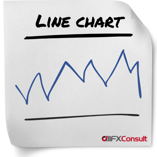
Line charts are also called close-only charts and for good reason. They take the closing prices of a given period, connect the consecutive points and create a line to represent their move.
Technical analysis today needs to be as accurate as possible, and a line chart doesn’t give the details of a trading session.
Many analysts favour line charts for their simplicity, since they regard the closing price of a session as the most important information to know. Dow (from Dow Jones) was one of these analysts.
Although more detailed charts are favoured by most, they can get really cluttered and don’t allow traders to spot events like a tight divergence.
Line charts display a clear trend direction, chart patterns and they can spot support/resistance levels, sometimes more accurately than other chart types.
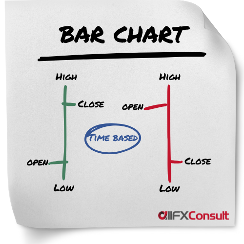
Bar charts were the most widely used charts before candlesticks were invented in the 18th century. They provide a more detailed representation of prices, since they display the closing price like a line chart, together with the opening price, and the highest/lowest price points reached in a session.
Knowing the added details, a trader can have a visual representation of the volatility of the security during a session. The opening price is always on the left, while the closing price is on the right.
Colours green and red, provide a quicker display of bearish or bullish sessions, making them more accurate than simple line charts. The colour of the bar, is chosen after calculating the difference between current closing price and previous closing price of the session rather than the open and close.
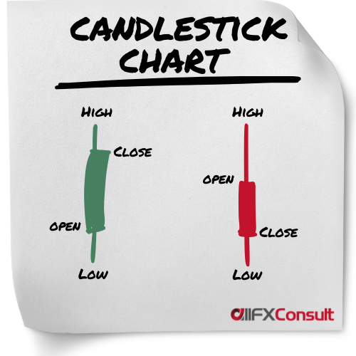
Candlestick charts, are the most commonly used charts in technical analysis. Their origin was traced back to the 18th century in Japan, tracking the price of rice, and they became very popular ever since.
They display the same information as bar charts, but in a different format. Wicks on top and below the bar display the highest/lowest prices of the session.
Colours green (or white) and red (or black) are also showing bearish and bullish sessions, but they take into consideration the opening and closing price of a session, rather than the closing of the previous session. The colours show the “real body” of the candlestick.
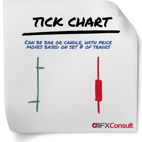
A new bar or candlestick is formed after a specific number of trades (ticks) have occurred, instead of after a time period.
A single bar might form in seconds during high activity or take minutes to form during a slow period.
This approach compresses low-activity periods and expanding high-activity periods, for a dynamic market representation.
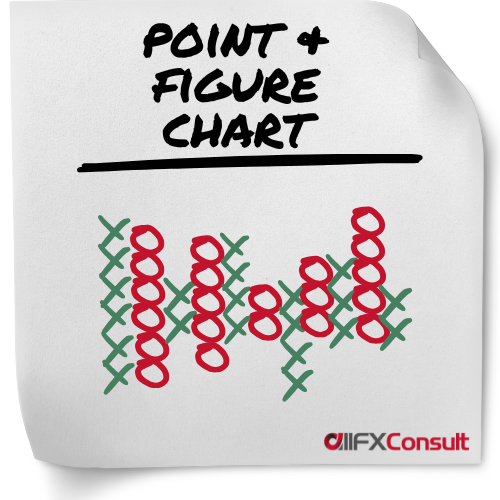
Provide a clear, simplified view of price movements by filtering out noise. These charts use columns of X (for rising prices) and O (for falling prices) to visualize price moves.
Can be subjective, as traders must set a “box size,” the price increment that must be reached to plot a new X or O. A “reversal amount,” typically three boxes must also be set (the price must move in the opposite direction before a new column of Xs or Os is started).
Best suited for position trading aiming to capture broader market moves rather than short-term trading.
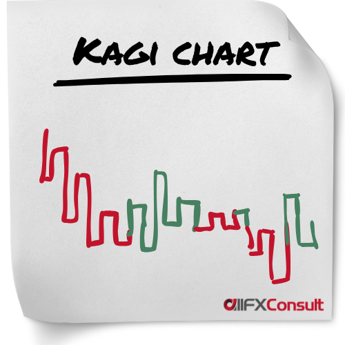
A preset reversal amount is determined (fixed amount, percentage, or based on Average True Range, and only when reached, a new line is plotted on the chart, ignoring time and volume in the process.
A number of vertical lines are connected in a series with short horizontal lines (also called shoulders when a rising vertical line connects to a vertical falling line). The horizontal lines are called waists when a vertical falling line connects to a vertical rising line.
To signal bullish or bearish trends, the lines change thickness or colour. A thick (or green) line is formed when the price increases above a previous high, known as Yang line. A thin (or red) line is formed when the price falls below a previous low, known as Yin line.
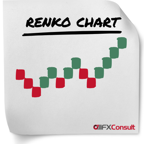
The charts are bult using uniformed sized bricks, as the name “Renko” from the Japanese word renga, means “bricks”.
A “brick size” is specified by the trader (by dollar value, number of pips, or average true range), which is the amount the price must move, before a new brick is added.
The new bricks, are placed at a 45-degree angle (up or down), adjacent and to the right of the previous brick.
When the price moves twice the “brick size”, the chart reverses and starts adding bricks in the opposite direction.
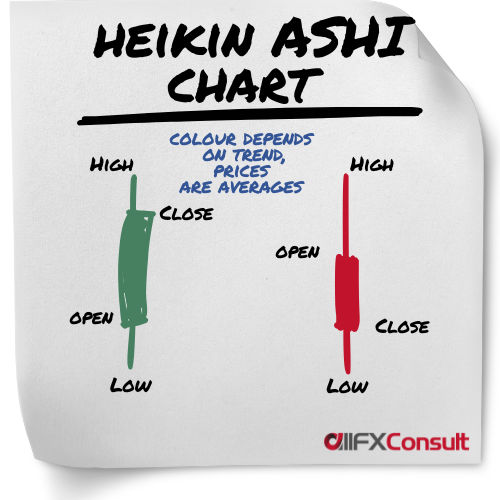
This chart resembles the candlestick chart type, with the difference that it averages all data points to smooth out price action and reduce the noise.
It’s a preferred choice by many professional traders, because it makes it easier to identify trends in comparison to traditional chart systems. Heikin Ashi means average bar, and it is used by traders to see the trend and general direction of the market, to signal reversals in trends, and support any trend strategy that makes sense.


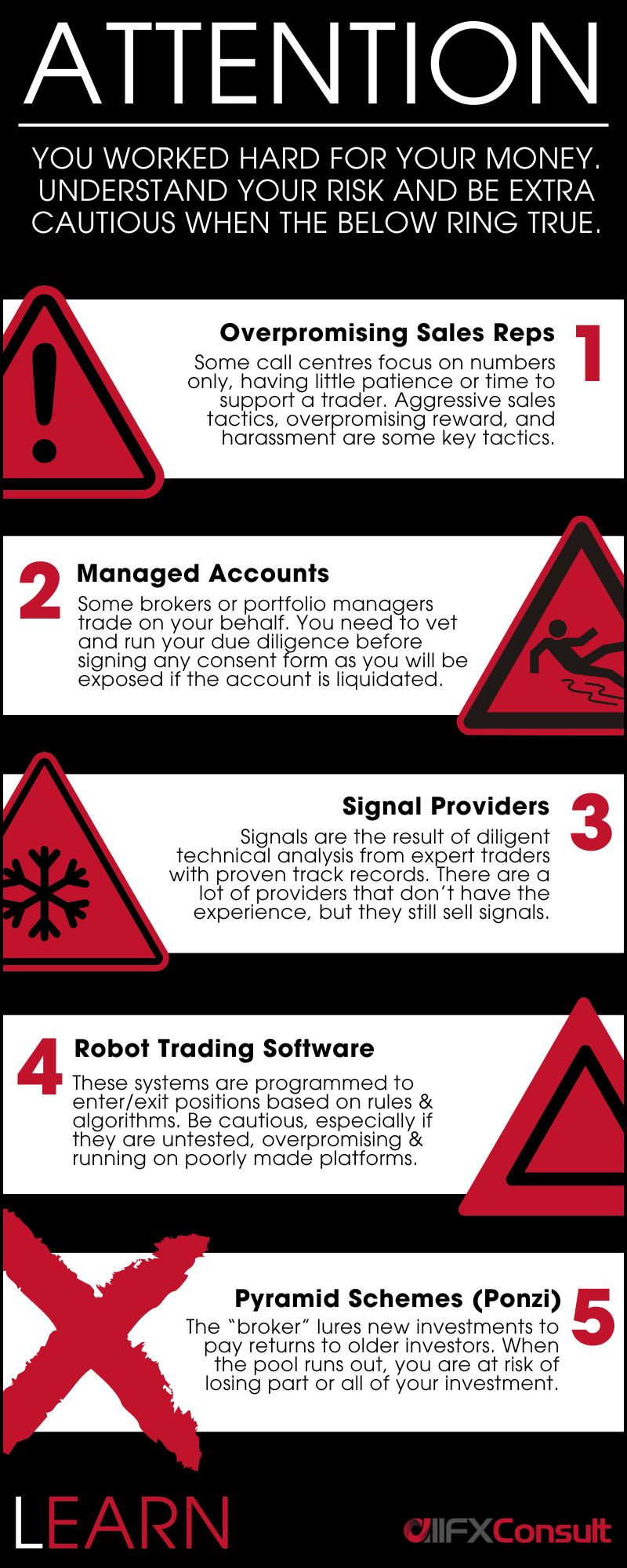
Finding the right broker is not so simple
But when the match is found, the possibilities are endless

Thinking of monetizing your network?
Thoughts, questions, support?
Our team is available 24/7